Professional Glossy “Download” Button

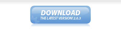
In this easy, step-by-step tutorial I’m going to show you how to design a simple, professional & glossy “Download” button. I’m just using download as an example here, it’s really a multi-purpose button ;) These kind of buttons are also being used a lot on “Web 2.0″ sites lately, so get with the times! (not seriously)

Glossy Download Button Result Image

1. Creating your Button

Start by creating a new document to make your button in, otherwise open up a website design you’ve been working on. I created a small document sized 400 x 110, just to make my button(s) in.

Now you need to make the shape of your button, you can do this by either using the Rounded Rectangle Tool (which is the most common) or you could use the channels to create a nice, uniform rounded box. It’ll be best if you just use the Rounded Rectangle Tool though.

Rounded Rectangle Tool in Toolbar

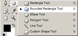
For the settings, use a radius of about 10-15px, you can see the other settings I’ve used below:

Rounded Rectangle Tool Settings

Now, draw out your button onto the canvas in whatever color you want. (it doesn’t matter what color you use)

Glossy Download Button Result Image

2. Apply Layer Styles

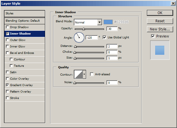
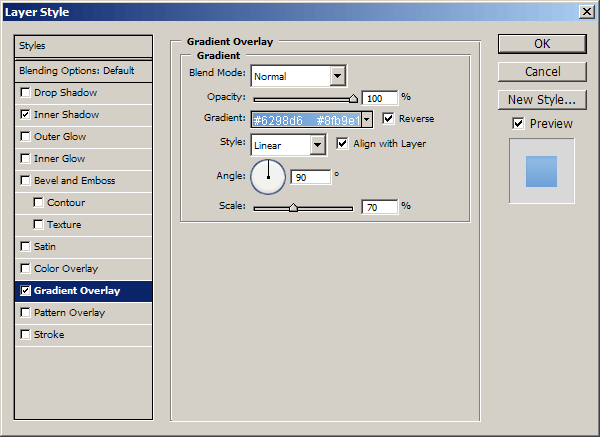
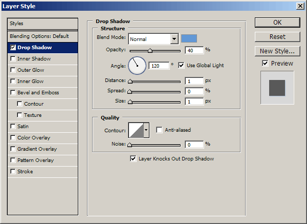
Right-click your button layer in your layer’s palette then go into the Blending Options, click and apply the following settings:

  1. Inner Shadow
  2. Gradient Overlay

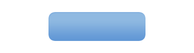
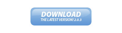
You can use whatever colors you want in the above layer styles, but your button should now look something like this anyway:

Layer Styles Applied

3. Highlight / Shine Effect

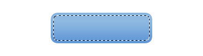
Now it’s time to add a nice, glossy shine to the button. Start by making a selection around your button (Select > Load Selection) then contract your selection by about 5 pixels (Select > Modify > Contract) now you should be left with a selection like this:

Contracted Button Selection

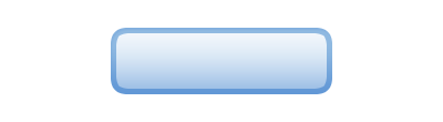
Create a new layer then drag a white to transparent gradient from the top of the selection to the bottom, as shown in the below image:

White Transparent Gradient

Now you need to make a curvy path using the Pen Tool, turn your path into a selection then delete the bottom half of the gradient, something like this:

I also used a large, soft brush to erase away the bottom edges, this gives it a very nice, smooth feel.

4. Text & Details

Now it’s time to add your text to the button! Start by getting out the Horizontal Type Tool (T) then write out your text.

Text Added - Myriad Pro

The font I’ve used above is called Myriad Pro, for the top line of text I used: Black Italic, 24 pt, Sharp, #fff.

For the bottom line of text I used: Semibold Italic, 12 pt, Sharp, #fff. I finished off by adding this Drop Shadow to the text layer.

Drop Shadow on Text

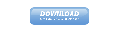
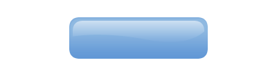
Lastly, for a nice touch, I added in a reflection to the button and a faded cog in the bottom left corner. Add the shadow/reflection by duplicating your main button later, moving it below your button layer then erase all but the top.

Reflection Added

You can download the cog shape that I used from: Cog Shape File.

Cog Shape Added

5. Finished

And that’s pretty much it. I also created a red version of the button though.

Red Version of Button

Thanks for reading, I hope you enjoyed the tutorial. If you want, you can download the PSD file from this tutorial from here: Pro Glossy Button Download.

6. HTML & CSS Markup

I’ve also made the coded version of this rollover button, for those that might be interested.

CSS Code:

#button { margin: 0; padding: 0; }
#button a { display: block; background: url(./button_off.gif) no-repeat; width: 200px; height: 0px !important; height /**/:72px; padding: 72px 0 0 0; overflow: hidden; }
#button a:hover { background: url(./button_on.gif) no-repeat; width: 200px; height: 0px !important; height /**/:72px; padding: 72px 0 0 0; overflow: hidden; }

HTML Code:

<h1 id=”button”><a href=”#” title=”">Button</a></h1>

View the output.

Return home. Published Jun 18th, 2007 under Web Graphics.
Previous Random Next
Digg Delicious Reddit Float Stumble

You must be logged in to post a comment.

34 responses

Geret Bary said:June 26th, 2007

wonderful thanks a lot

Sebastiaan said:June 26th, 2007

Nice though, although you could also try and style a button instead of an anchor.

(yes with javascript onMouseOver(), etc.)

This isn’t the symantically correct way to display a button.

Ben said:June 26th, 2007

Great stuff these shiny buttons are all the rage at the moment :)

pbase said:June 26th, 2007

Although I appreciate the effort, I don’t think you’ve given all the steps here.
Following your steps will not give you the shine gradient shown in the final version. Looking closely at the final stage of the gradient in step 3, you can see that the gradient has a different tone and shape, most noticeable at the top and corners.
I believe you may have overlooked a few important steps.

Trashy said:June 26th, 2007

Pretty neat, thanks a lot for the CSS-Version.

Daniel Neri said:June 26th, 2007

Really really neat!

Great job :)

lp said:June 29th, 2007

I really like your tutorial and I’m looking to create similar buttons however following along as I got to making the path and creating the shine affect it’s unclear what to do to make my graphic as clean? Do you have extra steps on how to make the curvy path using the Pen Tool and create the shine? Or can you point me to where I can find a more in depth tutorial on how to do this?

great job though!

Thank you!
lp

Eli said:June 30th, 2007

I’m sorry for not being very detailed around the Pen Tool area, for those wondering about it, please look up a detailed tutorial on using the Pen Tool.

Sorry again!

cinder said:July 15th, 2007

so cool.Thank you for sharing the tutorials.

Razvan said:July 25th, 2007

Great tutorial. Thx!

Damodar said:August 9th, 2007

Everything went on fantastically fine, but at last the pen tool and the shading made all the difference, I think you might have omitted some steps, I am not happy about that part at all.

Bob said:August 17th, 2007

This is really great and really helpful for my site. thanx!

tmem said:August 19th, 2007

thanks that is really good work

Sachin said:September 3rd, 2007

WOW…..that was really great exp for me.
thanks n keep it up……..

leia_organa said:September 20th, 2007

Hopeless - either post the FULL tutorial or there’s no point. It’s painfully obvious once you come to deleting the bottom half of the gradient with a pen tool selection, that this tutorial is incomplete. You can see that the next thumbnail bears no resemblance to what you’ve just done yourself in Photoshop - that’s because there’s at least one step missing folks! The opacity of the gradient is different for starters. Removing the bottom half of the gradient, without leaving a sharp edge, is the most important step and it’s been omitted. Very frustrating.

Jannifer said:September 25th, 2007

Thank you so much..

Zac said:October 14th, 2007

EAse up folks, If you’re a beginner, you might have some troubles….I mean c’mon, post a tutorial of how to use the pen tool???

Some of these things you need to know already.

If you want to have your hand held, cough up the dollars and go to college.

somu said:November 22nd, 2007

Thank you very much

Ashley said:November 27th, 2007

Awesome! Thanks!

Roben7k said:December 13th, 2007

Excellence!!! Thanks for spreading idea.

Anon said:January 5th, 2008

If you cannot follow this tutorial then you need to learn photoshop before trying to do anything fancy, steps were not omitted, the author was assuming that you knew your way around photoshop. Wonderful tutorial by the way.

Toni said:January 17th, 2008

Thanks - Great help!

Mike K said:January 18th, 2008

Thanks for the tutorial — it helped me out a lot! Definitely going to back to check out more tutorials.

Great job, and thanks again!
- Mike

oyun said:March 7th, 2008

Thanks for the tutorial, it is reaaly nice work and I liked red color it looks great.

Juhi said:March 21st, 2008

Thanks for this tutorial. I made a similar button for my website.

Silent Noise said:March 21st, 2008

My Favorite Button (DOWNLOAD)
My friends call me a download freak
That’s really nice thanx dude

Uwn said:June 3rd, 2008

Great tutorial!
But I agree with some speakers. There’s a thing missing here. =) I was searching for this shine effect the whole day, now thought I’ve found it here. But I think I must take some basic pen tool lessons first… now I know, that’s what I was searching for actually XD

anyway, awesome work!

suzan said:July 21st, 2008

Great tutorial!! Just tried it out.

Thanks a lot.

Trackbacks

  1. 18 Essential Photoshop Tutorials for Blogger | The Tao of Blogging to Wealth
  2. 18 Tutoriales de Photoshop para bloggers
  3. 18 Photoshop Tutorials for Bloggers | ARTEgami in English
  4. Web Sitenize 39 Eşsiz Photoshop Buton Tutoriali | Listeniz.Net
  5. Botao web 2.0 tutorial - Button Web 2.0 Photoshop
  6. Webincafe - Blog » 39 Photoshop Button Tutorials You Should Have in Your Arsenal