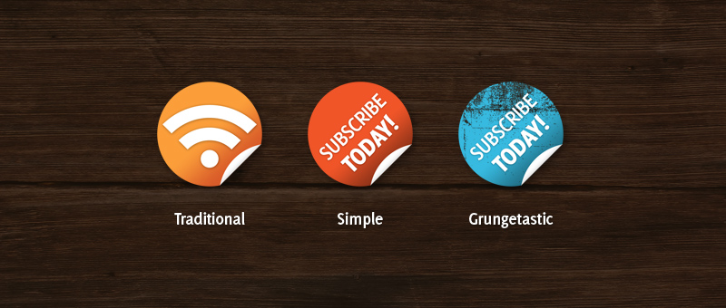
There have already been quite a few tutorials around documenting the making of these sleek, supermarket-style badges, but none of them have made them into subscribe badges! Well I actually have no proof of that assumption, but anyway.
In this Photoshop tutorial we’ll be making those cool supermarket-style badges, then we’ll be turning them into subscribe buttons for your website, a must-have for any blog!
1. Background
Well, the background obviously isn’t very important, but we’ll make something nice and simple for our badges anyway. Otherwise you could open up a blog template you have been working on, so you can implement the badge there.
I’ll be using a document size of 800 x 600 pixels for this, pretty small easy to work with size. After you’ve made a new document, fill the background with a dark color. In this case I used a dark brown (#2e1f13).
OK, after you’ve got the background color set, you might be happy with that, or you can find a nice wood texture and put it on the background as well.
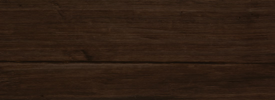
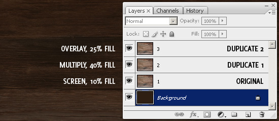
OK, so if you want some nice wooden board textures, you should check out CG Textures. Now, if you’ve got a texture, copy it onto the canvas and resize it. After this, lower the opacity and mess with the layer modes to blend it in with the color a little more.
You may need to repeat this step a few times using different layer modes and opacities.
2. Badge Base
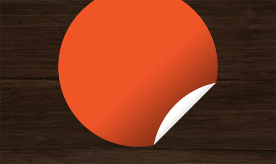
Let’s create the base of our badge now. Firstly, find and get out the elliptical marquee tool, then make a selection in the middle-area of your canvas. Create a new layer, then fill your selection with an appropriate color.
![]()
Alright, now you have the shape, we need to cut away a small corner and rotate it. To do this, first get out the polygonal lasso tool, then select a corner of your shape like so:
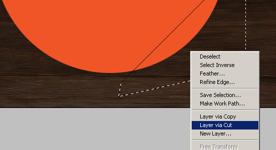
Right-click your selection and go to layer via cut, this will cut the selected pixels and place them in a new layer. Rotate your peel effect layer (edit > transform > rotate 180) then you may need to move it slightly so it’s exactly on the corner.
Lastly, fill your little shape with white or another very light color, so it contrasts well against the base layer.

Now we’ve got a cool peeling effect. I’m hoping I’ve been explaining thoroughly enough so far! 😉
3. Effects (Layer Styles)
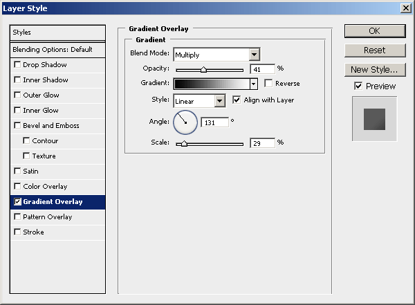
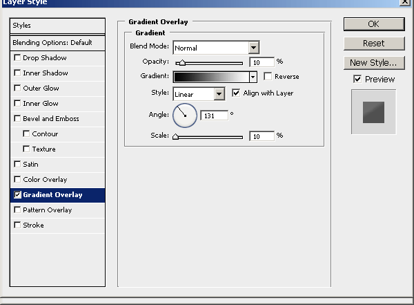
Now, how about we give the badge a little more depth? What we want to do is apply a Gradient Overlay layer style for each of our layers, so right-click your layer and go into the Blending Options.
- Gradient Overlay (base badge)
- Gradient Overlay (white peeling)
Note: You may have to move the gradient around a little bit, do this by dragging your mouse around below the blending options box.
Much nicer.
4. Add Text
Now let’s add some text. Get out the horizontal type tool (just the regular one) and write out something like ‘Subscribe Today!’ on two lines.

Note: The font used above is called Delicious, and it’s a free font that you can download from here.
Alright, now you’ve got some nice text done, you’ll want to rotate and situate it on top of your badge. While rotating (ctrl+t) you may want to size it down so it’s more of a snug fit.

Alright, looking nice! Lastly to make the text stand out a little more, you should add a slight Drop Shadow layer style.
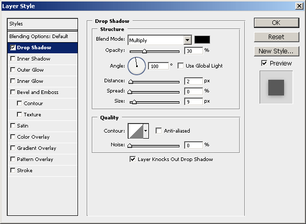
Additional
To finish off, you should merge all of your badge layers together then size the whole thing down to about 25% of it’s original size (depending on what size you made the original).
You should also try different things with the badges, such as adding a grungy layer mask, or going with the traditional style of the RSS icon.
Thanks for reading everyone, if you have a question, a suggestion or a comment, please leave a comment below using the form, or send me an email.
Subscribe
If you enjoyed this tutorial, then you may be interested in subscribing to PhotoshopStar to get updates via email or feed reader! 🙂