I really love this kind of style, so I thought just I’d share another tutorial with you guys (and girls, of course) on how to design something like what I’ve shown below, a kind of glossy, carbon fiber navigation set 😉

1. Grungy Background Creation
I know this navigation set will most likely be going on a clan website design or something like that, but I really love designing really cool, grungy backgrounds for my tutorials anyway, so if you would like to learn how to design the background I’ve shown in the image below, continue with this step, if not you can just skip to the next step.
Start by creating a new document in Photoshop – I used a small document size of 400 x 400 pixels (as usual), but you may want to use something a bit bigger, as it’s always a good thing having plenty of space to work with. After creating your new document, find and get out the Gradient Tool, set the gradient type to Radial and drag a gradient in the background.
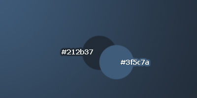
If you want your background to come out the same as mine shown above, then you’ll want to change your foreground and background colors to the ones I’ve shown above!
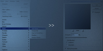
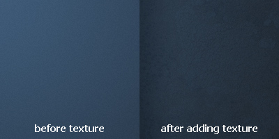
After making your gradient apply Filter > Noise > Add Noise with a fairly low amount.
Try some other Filter effects to give the background a nice look. The filters under the Artistic and Brush Strokes categories are usually pretty cool. Well, we’re done with the main background, now it’s time to add some more details – textures and grunge brushing!
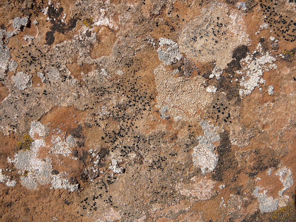
So, are you more interesting in adding texture to your background, or just grunge brushing hanging off of the corners? The quickest is probably just putting a texture over the top and changing the layer modes/opacities, so let’s give that a go. Start by downloading this texture of moss on rocks, then copying it into your document.
After pasting the texture on your canvas, change the layer mode to something like Multiply, Overlay or Soft Light, I personally used Multiply. After changing the layer mode, lower the opacity to whatever looks suitable to you. (I used 20%)
Personally, I prefer the random brushing, so I simply hid the texture layer and did a little bit of brushing. I’ve got a small page dedicated to free Photoshop brush resources, or you can use one of the following:
Download some free brushes and install them, then do a little bit of brushing in the corners, remember to mess around with different layer modes and opacities.

The main brushes that were used there were:
- Large Retro Brushes (background)
- Random Grunge Brushes (from Misprinted Type)
To get a good outcome, you’ll want to use different colors for your brushing (the colors used in the background gradient as well as black and white) and also play around with the layer modes, this is very important for a good outcome. And remember, the download link for the PSD file is available at the bottom of this tutorial, so don’t get distressed because I’m not giving specific details!
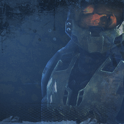
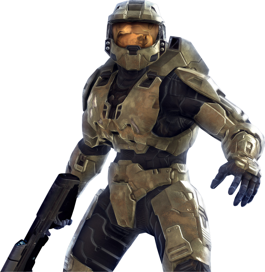
After finishing with your brushing, there are some other things you can add to the background, for example, a cutout render from the game that this design is for, in this case I used a cutout render of the MasterChief from Halo After pasting the render on your background, change the layer mode to something like Color Dodge and lower the opacity if you feel it needs it.
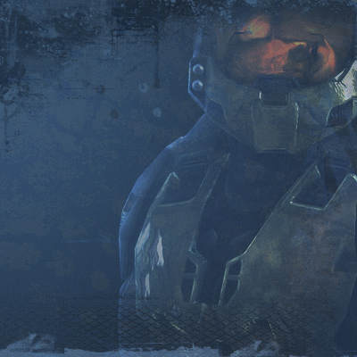
Looks pretty nice now, don’t you think?
You can finish the background off by flattening the image, duplicating the remaining layer, applying some layer styles then messing with the layer modes, this gives the whole background a bit of a nicer contrast, I think 😉

Looks to me like the background creation was the highlight of this tutorial! Anyway, continue on with the tutorial, if you want anyway!
2. Creating the Buttons
As I’ve said once before, there’s two ways of making rounded buttons… well, three. The first way (and the worst, but easiest) is making a square selection then using the smooth feature to smooth out the selection (Select > Modify > Smooth) this will make the corners of your button very sharp though…
The second and most common way of making rounded buttons is using the Rounded Rectangle Tool, where you just set up the settings then drag a button onto the canvas, which is what you should do, but make sure you get it the size you want, as you’ll have to chop it up and move it around if you want to resize it later on.
The third way (and the way I usually use) is using Photoshop channels and Gaussian Blur to make rounded edges. You can view a few tutorials on how to use this method below:
- Interface Basics Tutorial from ethicsdesign
- Smooth out Jaggies from Heatherowe
So, basically, just make a rounded button on your canvas (in a new layer) using any method you know. This is what I came up with:
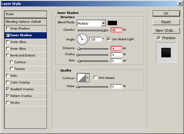
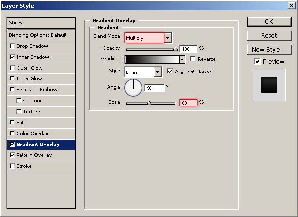
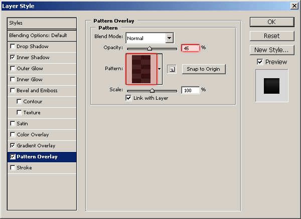
Right-click your button layer in the layer’s palette and go into the Blending Options, click and apply the following layer styles/settings:
- Inner Shadow
- Gradient Overlay
- Pattern Overlay (for the pattern overlay, you need to create a simple carbon fiber texture, you can find two good tutorials on how to make carbon fiber here, and here, or download my pattern from here.)
And now I’ve got this after applying the layer styles:
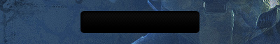
Looks pretty nice, if you can’t see it very well though, up the opacity for the Pattern Overlay.
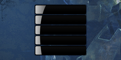
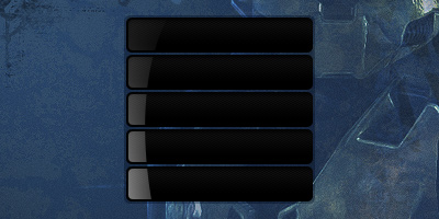
Now it’s time to duplicate the buttons. Right-click the layer and click ‘Duplicate Layer…’ then move the button downwards until there’s about 2 pixels spacing between them, repeat this as many times as you want until you have enough buttons. I ended up with 5 buttons:
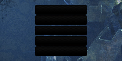
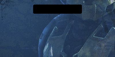
Pretty much done for this part, except I added in a container area for the buttons, using the color #3f5c7a and layer mode Multiply and opacity 50%.
3. Button Details – Glossy Shine
Start by selecting all of your buttons, do this by holding ctrl then clicking the first button layer, then you’ll have to hold ctrl and shift and click all of the other button layers.
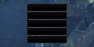
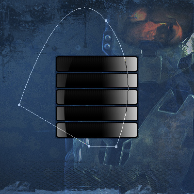
After selecting your buttons, contract the selection by about 2 pixels, you can do this by going to Select > Modify > Contract in the Photoshop menus. Good, now, create a new layer and draw a white to transparent gradient from the left of the selection to the middle area, like the one shown below:
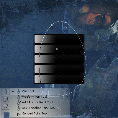
Going good so far, now, make a nice, curbed path using the Pen Tool on top of the gradient area, like mine shown below:
After completing your path, turn it into a selection by right-clicking the path and going to Make Selection, now press delete so that it deletes the gradient in the area of your selection.
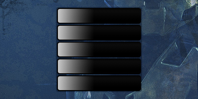
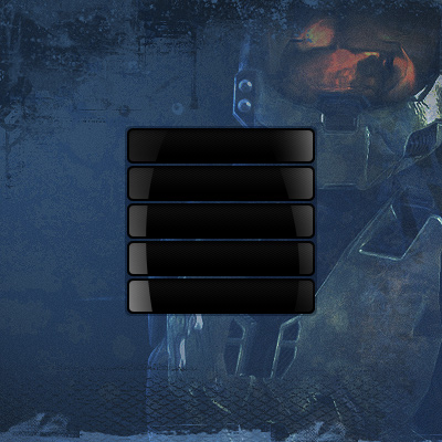
To finish this side off, add a layer mask and drag a black gradient from the top of the buttons down to the bottom, so you get a result like this one:
Looking good. Now you need to do the other side of the buttons, again, select all of the buttons and contract the selection, then make a white gradient from the right to the left on a new layer.

Again, create a path over the white gradient on the right using the Pen Tool, just copy the shape of mine if you want:
Again, make your path into a selection and press delete to remove the selected area. Finish off by erasing the bottom part of the shine.
Finish off by adding text. Since this is for a clan website, you’ll probably want to use either an eroded, grungy-style font, or a pixel/bitmap font, I ended up using the pixel/bitmap font called ‘PF Ronda Seven,’ which you can download for free from DaFont. Write out your text in white, 8 px.
![]()
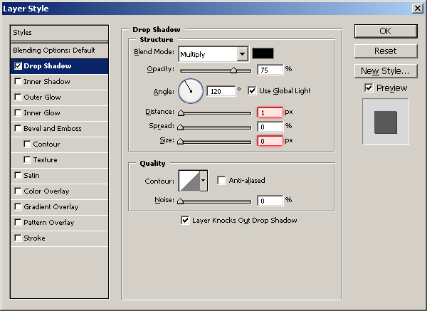
I also applied this (Drop Shadow) to my each of my navigation text layers.
Well, I think we’re just about done! Thanks for reading, and I hope you enjoyed the tutorial!