Smooth, Simple Glossy Navigation Bar

In this very easy Photoshop tutorial we’ll be learning how to design a nice, sleek navigation bar that you can use on your website design. This is a beginner tutorial, so if you’re an intermediate or professional Photoshop user, I’m not sure you’ll be learning from this ;)

1. Create a New Document

First, start by making a new document in which you can make this sleek navigation bar! (I used a regular template size of (800×1000, but you might want to use a much smaller size for this tutorial.)

2. Create the Bar

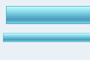
Start by creating a new layer. Now make a selection inside of your document, fill your selection with #52A1C4.

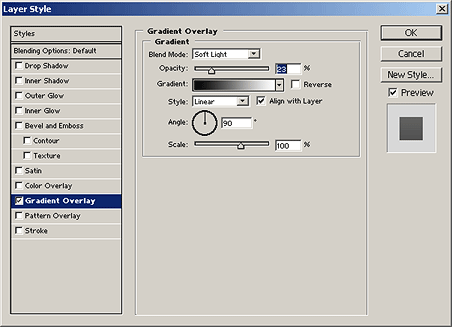
Now please apply the following Gradient Overlay in the blending options/layer styles:

3. Add a Glossy Shine

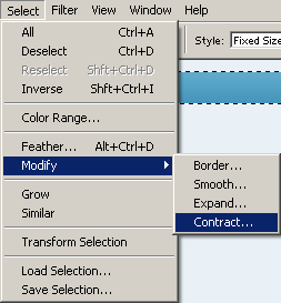
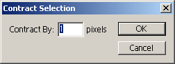
Create a new layer and select the main bar layer (CTRL + Click layer thumbnail) now contract the selection down 1 pixel by going to Select > Modify > Contract in the menu.

After contracting the selection, find and get out the Gradient Tool () and set the gradient to Foreground to Transparent gradient

From the top of the selection make a gradient into the middle area like so:

Now a much smaller gradient at the bottom:

Change the layer mode for your gradient layer to Overlay, and lower the opacity if necesary.

4. Adding some Text

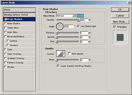
For the text I used: Tahoma, 11 pt, Bold, White with a 100% Drop Shadow as shown in the below image:

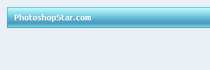
My finished product:

Thanks very much for reading everyone! I hope you enjoyed this tutorial, even if only a little bit.

And thanks for visiting PhotoshopStar, your source for free Photoshop tutorials.

Return home. Published Jun 19th, 2006 under Web Graphics, Website Design.
Previous Random Next
Digg Delicious Reddit Float Stumble

You must be logged in to post a comment.

16 responses

James said:June 19th, 2006

Very cool, love the colours! :)

Madhouse said:June 21st, 2006

love that navbar, will be using that tut very soon :)

RuxA said:June 22nd, 2006

thx , nice tut greetz form germany ^^

cocabottle said:June 22nd, 2006

nice tutoriAL gonna try it soon :)

@ruxa Greetz from Holland

Alberto Marlboro said:June 22nd, 2006

Thanks for sharing.

Alberto
from Brazil !

s3.invisionfree.com/shadowsover said:June 22nd, 2006

not bad….looks really cool….good work dude!

Watera said:June 29th, 2006

The bar looks stylish, however I would recommend a darker color for it, as the contrast between bar and text is not excellent.

Fayyaz Ahmed said:July 4th, 2006

Its really very good tutorial and it was very helpful for me to make good effects.

Dan said:July 5th, 2006

Looks good, but when I tried to follow it it failed at step 3 as Modify was greyed out :-( Any ideas why that is?

Dan said:July 5th, 2006

Just figured out what i was doing wrong. I wasn’t using an overall background larger than the layers we were working on. did it again with a larger background and it’s now working fine!!

tima said:July 25th, 2006

Wow , good stuf

one said:November 15th, 2006

simple & gooooooood. thx :)

Moonflower said:February 11th, 2007

Very detailed. thanx. :)

Anna said:March 29th, 2007

Marvelous!! Very helpful!! :D

Melissa said:December 18th, 2007

Thanks for the tut! I used a dark color and it turned out great!

Jeff Swanson said:March 14th, 2008

Awesome, simple tutorial. Finally, someone showing a photshop/web graphics tutorial where the finished product actually looks like something I want to put on my site. Keep up the good work.