In this intermediate Photoshop tutorial, I’m going to be teaching you how to make a really wicked, grungy-style band website template. Personally, this is one of my favorite designs/tutorials ever, so I really hope you enjoy it.
(click above image for full size)
1. Designing an Awesome Band Website Template
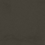
Obviously, the first thing we should do is create a new document. For this tutorial I’m using quite a small size of 760 x 760 pixels, you might want to use something bigger. Next thing to do is fill the background with a fairly dark color, I used a gray-brown. (#47433a)
2. Add Texture to Background
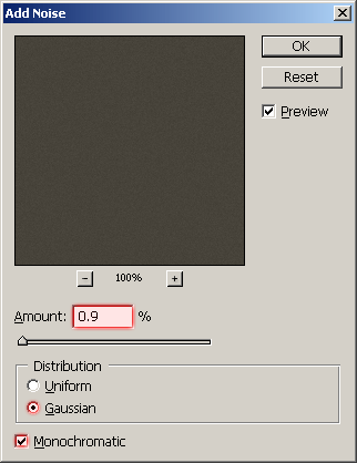
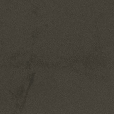
To add some texture to the background you can apple some filters or slap a grungy stock photo over the top and change the layer modes. I started off by applying the Noise filter with a low setting. (Filter > Noise > Noise, amount: 0.9)
Now we need to add in some nice and subtle details to the background. Firstly, add some grunge-brushing to the background. You can find some really awesome grunge brushes on DeviantART, courtesy of ~KeReN-R. Now you’ve got your brushes installed, pick a random one and use it a few times on the background. Change the layer mode for your grunge-brushing layer to either Soft Light or Overlay and maybe lower the opacity (something like 20-50%).
Start off with some soft grunge brushing:
Make a little more (remember to use different brushes):
Brush in different places on the background:
Remember to use low opacities, or change layer modes to either Overlay or Soft Light to get a good, blended effect:
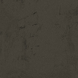
You should be left with a nice grungy background something like this:

3. Finishing off the Background – Add a few more Details
Now for the background I added a stamp brush that I made real quick. I’ve actually written a tutorial on a similar effect before, you can find it over here: Branding Iron Effect Tutorial.

After I made the stamp I lowered the opacity to about 30% and changed the layer mode to Soft Light (this blends it with the background).
Lastly for the background, I merged all of the layers together (Layer > Flatten Image) then I applied the Lighting Effects Filter. (Filter > Render > Lighting Effects)
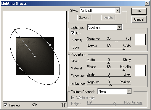
And now you should have a pretty cool background like this:

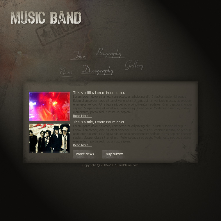
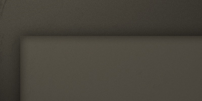
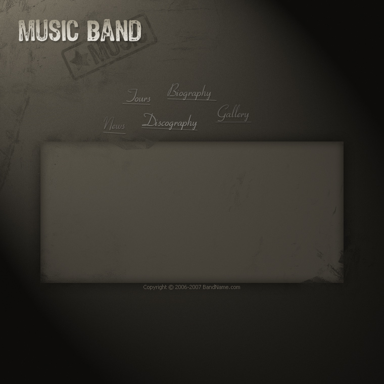
4. Designing the Content Section (a must!)
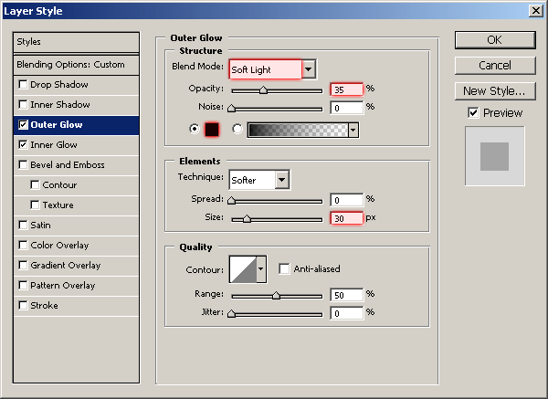
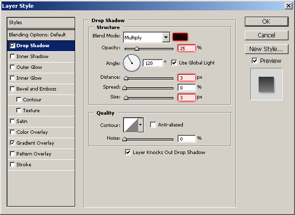
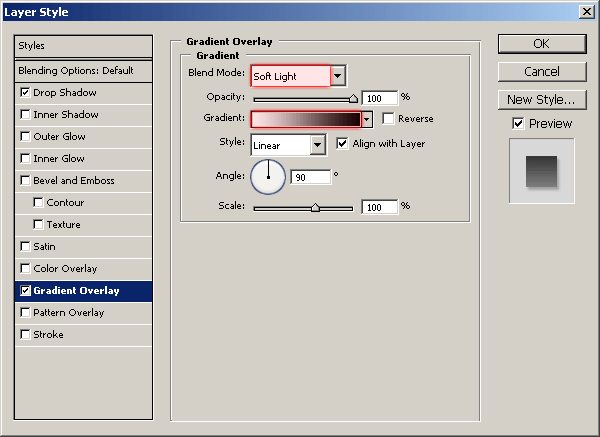
Every website needs a content section, so let’s make ours. Simply start by creating a rectangular box in the middle of the document. Fill your rectangle or selection with a lighter brown color than what you’ve used in the background. The color I used here was #716a5d. I then lowered the fill for my content section layer to 40% and applied the following layer styles:
You should have something like this:
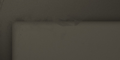
Add a layer mask to your content section (Layer > Layer Mask > Reveal All) and using a random grunge brush from the brush pack, brush a little in the layer mask using black as your color. This will remove parts of your layer, but it’s not like using the eraser, you’ll be able to edit it later on if you want to.
5. Designing a Basic Text Logo
Now it’s time to give the template some life, let’s add text! Start by adding your main logo text ‘Band Name’ in the top left. For the font I’ve used a cool, grungy font called 4990810, and for the font size I used 48pt. This is a free font, so please feel free to download it from here: download 4990810 from DaFont. The color I used for my logo text was #c9c4b8, and to finish off I added these two layer style effects:
And now I have this:

Not looking too bad, is it? 🙂
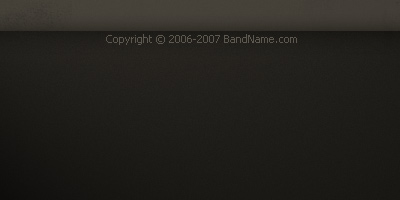
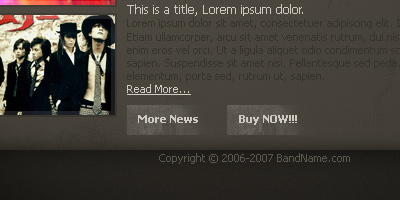
Now you can add the unnecessary but probable copyright text underneath the content area. I simply used Tahoma, 11pt, #5c584e. Don’t fret though, Tahoma comes with Windows! Another good candidate for this text is Arial, which also comes with Windows.
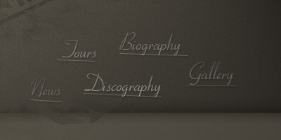
Now, what else is a must for a website? Navigation of course! Time to add in our navigation text/buttons.
The font I’ve used here is called Cornet, but since I’m not sure it’s a commercial font or not, you might want to go to a free font website and look for a calligraphy-style font. After I wrote out my navigation text (News, Tours, Discography, Biography, Gallery,) I applied the following layer styles to the text layers:
I’ve made the fill opacity for each text layer vary so it adds more detail, just a nice touch. Whatever! 😛
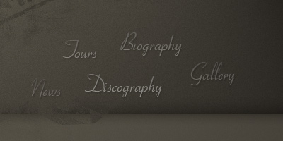
Lastly, I added a random underline to each of the navigation items using the line tool. (it’s on the same icon as the shape tools somewhere) Just remember, these lines can be far from perfect! I finished off with the underlines by copying the layer styles from the text layers over to the underline layers. Just try and be creative in anyways possible.
6. Add in some Content
We’re doing pretty well so far, keep up the good work. You can see what I’ve got so far here: Band Website Design.
So, let’s add some dummy content. Head over to YotoPhoto and search for ‘band’ or something like that and get some cool, random stock photos. Drag them over to your canvas and resize them.
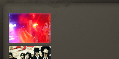
In the above image I’ve resized my images then cropped them to 140 x 100 pixels, I then added two borders, a 4px light border on the inside, and a 2px dark border to the outside. I finished off by adding some filler text to the right of the images. All I used here was basic ol’ Tahoma, 11pt/12pt, and light/dark brown colors.
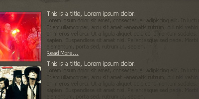
Also, for a nice small touch, I added a few light grungy buttons under the filler text. All you have to do to make these is make a white rectangle, change the layer opacity to something very low then erase away the edges.
7. We’re Finished! Congratulations.
So, now we’re finished. A nice final touch, in my opinion, would be to add some photos in the top left then blend them in a little bit. (blend them in for example by using the eraser tool, then changing the layer modes/opacities)
Thanks very much for reading guys (and girls, of course!) I hope you enjoyed this tutorial! (one of my favorite to date)