Well, well, well. In this Photoshop tutorial I’m going to attempt to make some half-decent cartoon/comic-style text. You know, like the stuff on the front of comic books.
1. Canvas / Background
Start by making a new document in Photoshop. You might want to work at a large size/resolution, so you can resize it to whatever you want later on. It’s easiest that way as well.
So, create a document sized around 1650 x 1020 pixels in size, something random really. After creating your document, fill the background with a random gradient, something that looks good.
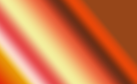
Nice gradient? Maybe not. Anyway, the colors used in the above gradient are:
- #97461a
- #db0a1e
- #e89606
- #fbd8c5
- #e64949
- #f3ee9d
- #e55a35
- #6c2e16
- #e84709
- #97461a
- … *cough*
Holy crap that was a lot of colors… just a random gradient, got it?
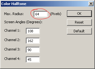
After you’ve got the gradient in your background, duplicate the Background layer then go to Filter > Pixelate > Color Halftone, use similar to the following settings:
Well, now you’ve got a sort of … color halftone-y effect on the background 🙂
Change the layer mode of your Background duplicate layer to either Darken or Multiply, and lower the opacity to around 30-50% if you think it’s necessary. Depends on your tastes.
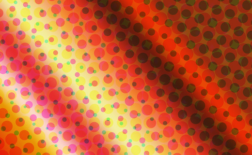
Alright, now we have a half-decent, cartoon-themed background 🙂
2. Type / Font Selection
Alright, time to select some type. Head over to DaFont, UrbanFonts, or Google and find a nice, cartoon-style font. I’ve outlined a few nice selections below.
44 Font – UrbanFonts

Cookies Font – DaFont

Bubblegum Font – DaFont

Arnold Font – UrbanFonts

Cartoonist Kookie – DaFont

Well that’s enough fonts from me… chosen one yet? Well then (assuming you’ve found one), write out some text onto your canvas!
3. Warp / Distort Text
We now have the joy of distorting our text 🙂 Start by selecting your text that you just wrote out, using the type tool. Near the top of Photoshop you’ll see an icon with a curve-like path and a T above it.
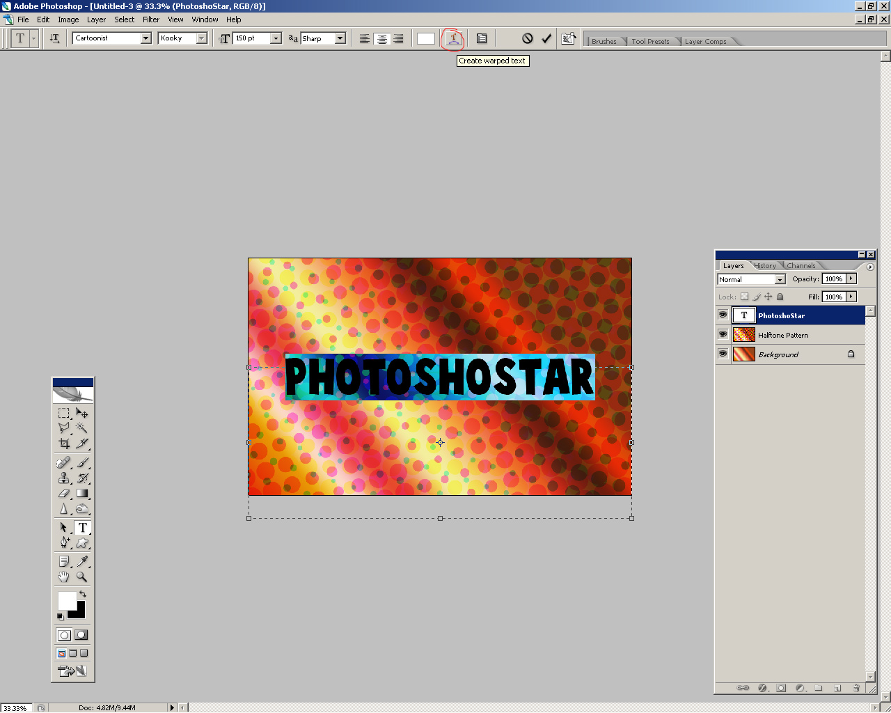
Click this icon (Warp Text) and mess around with the different settings/options until you get a nice effect.
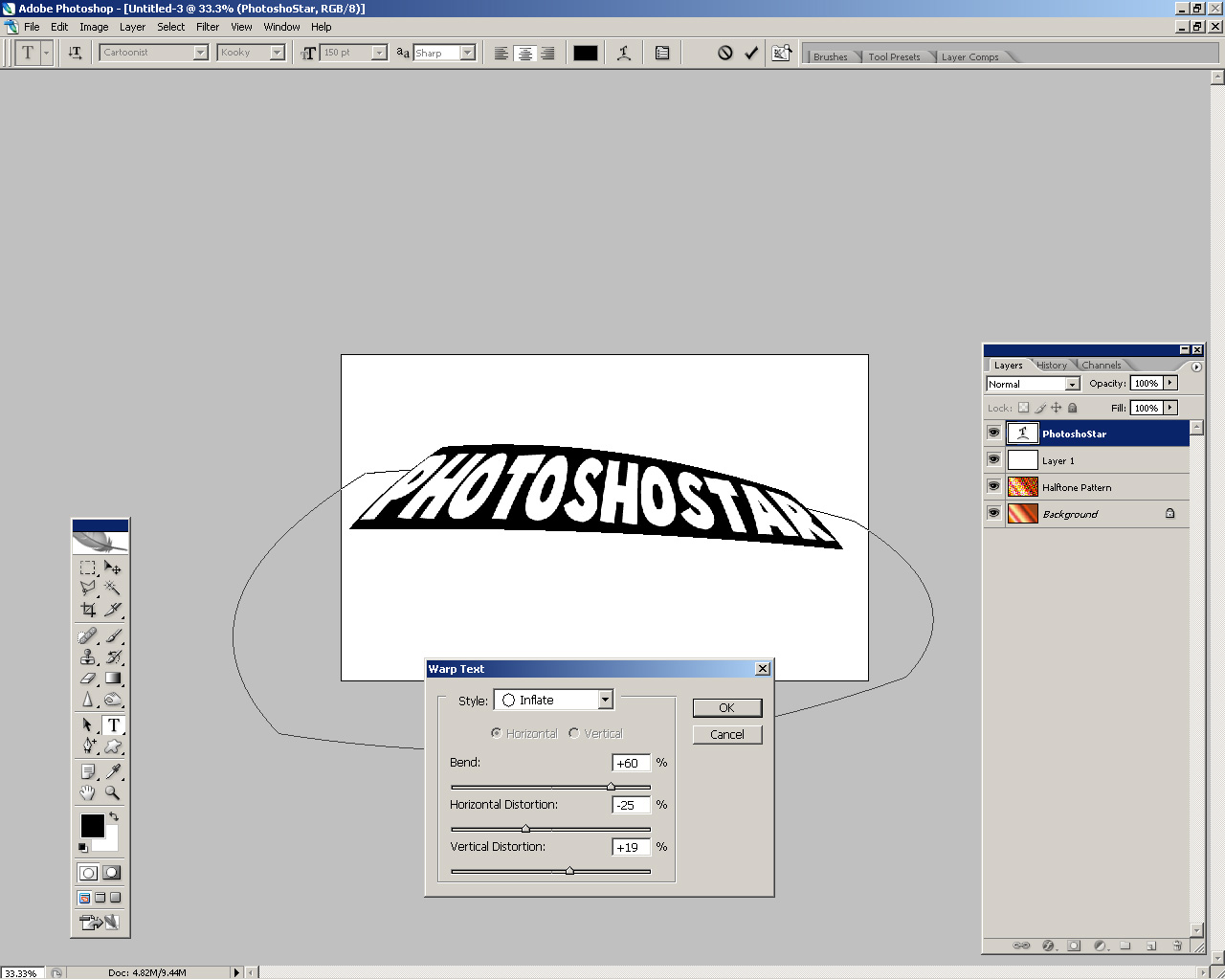
Alright, got some nice distorted text? Well then, make sure your text is white, and your background is still intact, then let’s move on.
4. Add Text Effects
Let’s start with the solid drop shadow on the text. First, zoom in to 100% on your document. Now, get the Move Tool out and select your text layer.
Holding the ALT key down on your keyboard, press the right arrow key, then the bottom arrow key, this duplicates and moves your text layer, thus making a solid drop shadow once you duplicate it enough times. I’m hoping you understand this 🙂
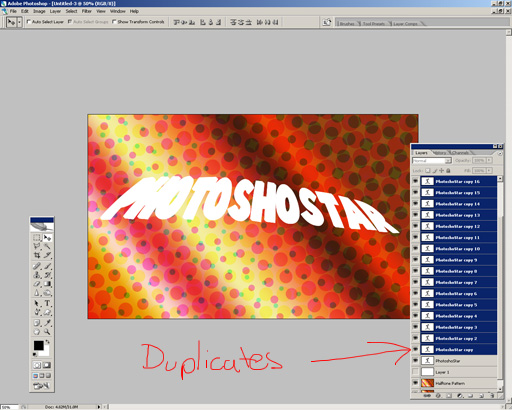
See the layer’s palette? Your layer’s palette should look something like that by now. 20 duplicates is a good amount I found.
Merge all of your duplicate layers together (don’t merge the main text layer!) and fill it with black.
Please note I also moved the shadow layer underneath the main text layer, so white is on top, black is on bottom.
Ok, how’s yours going? Well, we’re done for the drop shadow. What else do we need? How about some layer styles.
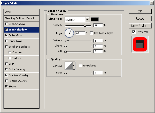
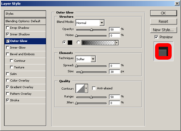
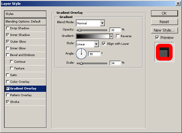
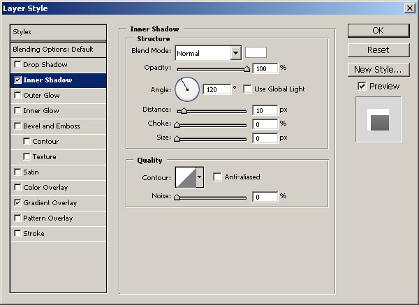
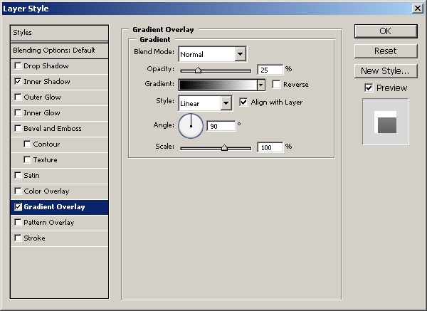
For the black text layer:
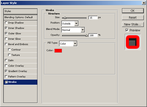
For the white text layer:
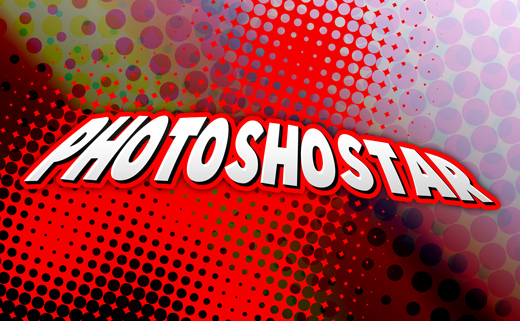
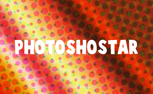
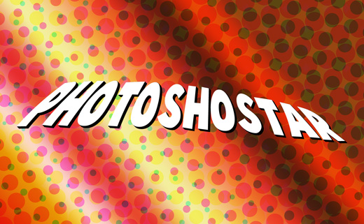
Please feel free to experiment with other layer styles and settings, but I’m finished with these. After applying those layer styles, your text should now look like this:
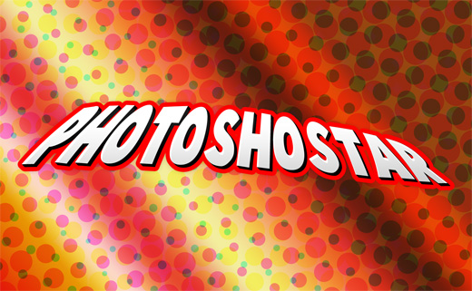
That actually looks pretty slick! In my opinion, anyway…
At this point, I think we’re pretty much done, but let’s continue onto the next step anyway, even though I’m not really going to do anything else 😛
5. Finito
Well, everyone, looks like we’re finished. I hope you enjoyed this tutorial! Was the outcome alright? Got any suggestions? Drop a line below using the comment form.