A quick Photoshop tutorial on the making of a grunge-style TDK (The Dark Knight) wallpaper! Is anyone else here looking forward to this wicked film? 🙂
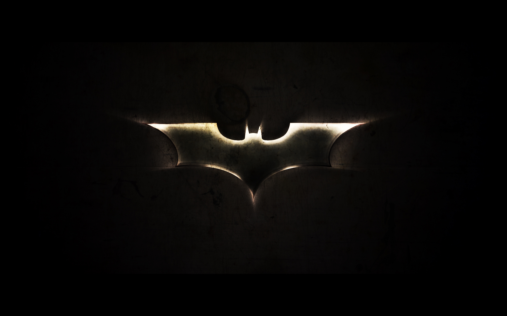
(1680 x 1050 download)
Introduction
I’d like to point out that I was inspired to design this after seeing (and using) Louie Mantia’s The Dark Knight wallpaper, which you can find here. He also has tons of other amazing wallpapers that you can download in fullscreen or widescreen resolutions.
Obviously you know what we’ll be making in this tutorial, but you should know that you should at least have basic knowledge of Photoshop to follow completely through. We’ll be using a lot of the basics in Photoshop, including tools and layer-related stuff.
1. Making your Canvas
We need to start by making a new document in Photoshop. For this tutorial you should use the resolution that fits your screen – in my case 1680 x 1050! Bring some rulers onto your canvas in the center.
Select some appropriate colors then drag a radial gradient in the middle of your document.

Colors used were #3d3b3c and #0e0d11.
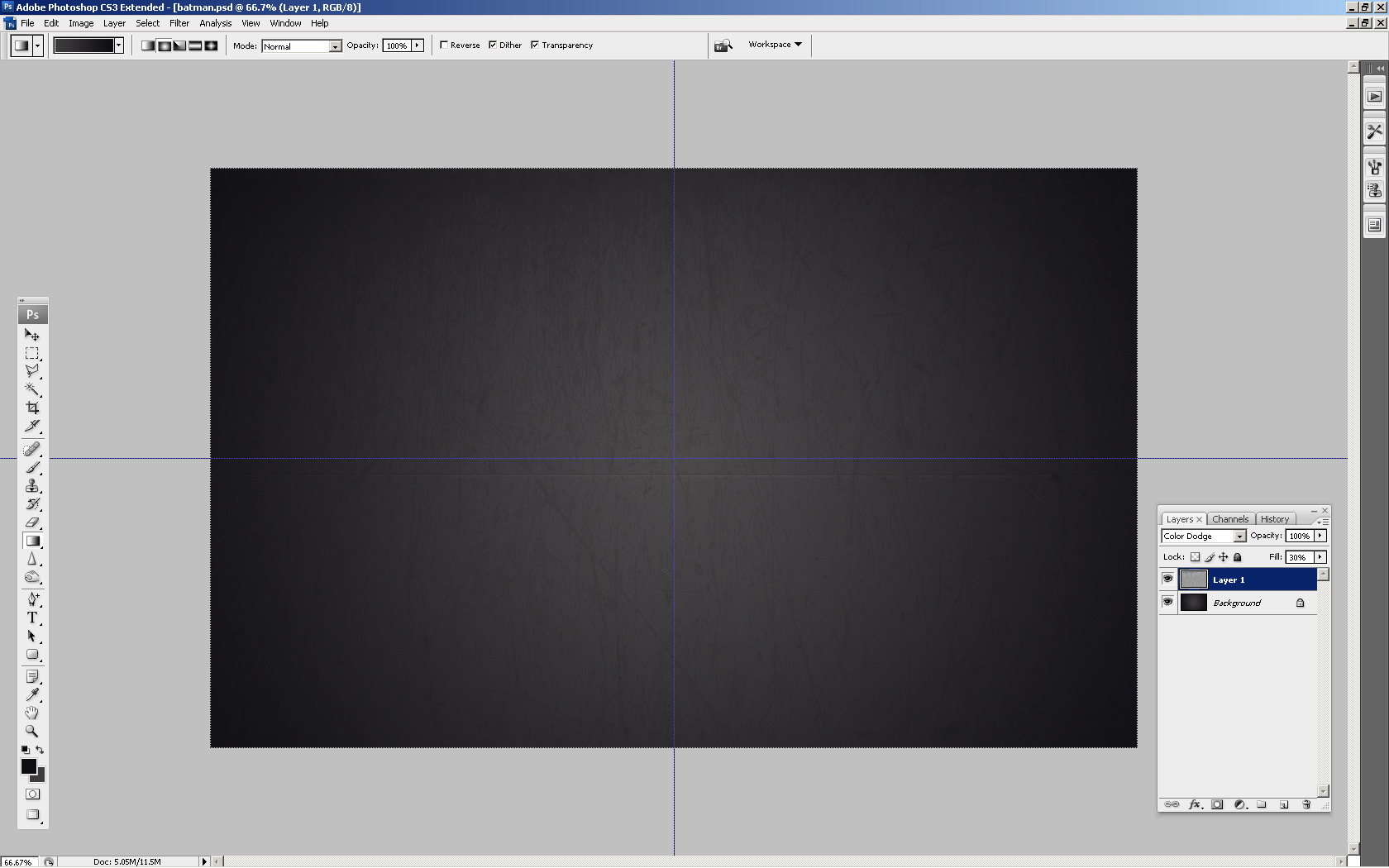
2. Background Texture
Time to add a little detail to the background. Find and copy onto your canvas a nice, grungy texture. For this you can use paper, stone, abstract or whatever! A good place to start is CG Textures.
Start with a texture of some metal scratches. Copy it into your canvas, resize it then mess with the layer mode & opacity/fill. I tried Color Dodge with a fill of 30%.
Get another texture, this time you can use something random. Again mess with the layer mode and opacity, use whatever comes out nice & to your liking.
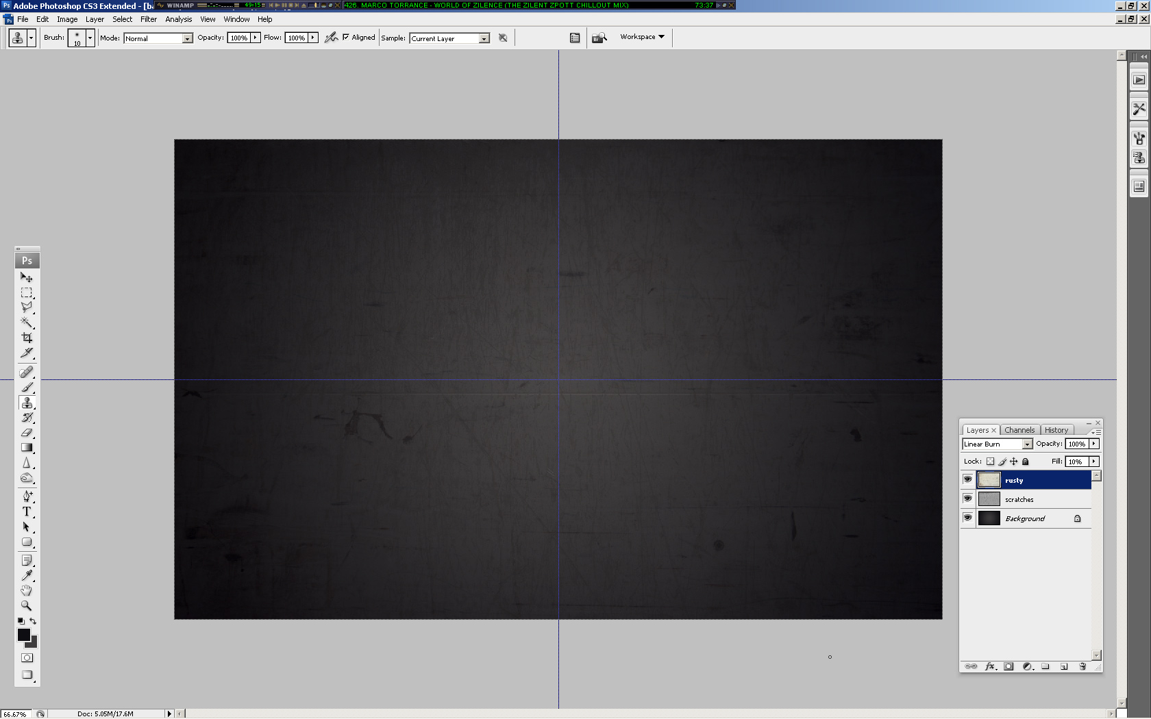
(rusty metal texture added)
3. Bat Logo
Time to get a nice bat logo for our wallpaper. For this you might want to go to Google Images and search for a good-quality batman logo. Just remember, go for the new and much cooler batman logo, not the old corny one from the ’60s 😉
Since I’m no professional with the Pen Tool or Illustrator, I enlisted the help of my brother Simon in tracing the batman logo, and it came out perfectly:
![]()
If you want to download the batman logo used above, please feel free: Download Batman Logo PSD
Copy your bat logo onto the canvas and rasterize it (conver it to pixels). Now you may want to make a few duplicates of your original layer, just in case something goes wrong.
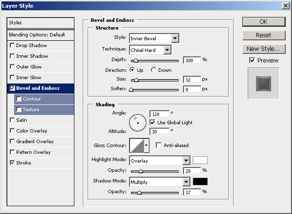
4. Metal Effect (Bat Logo)
Now we want to make our bat logo a bit more interesting. Do you have any ideas on how to do that? I personally had a great struggle with this part… but anyway, follow this and I’m sure we’ll come out with a decent metal effect 😉
Start by darkening up your logo a little bit (start with a base color of #878787). Now, head into the blending options for your bat layer and apply the following layer styles:
Remember: depending on what size document and logo you’re working with, you may need to tweak those settings. I now have a basic beveled effect:
![]()
OK, not looking so great, yet!
Create a new layer (layer > new > layer) then merge this layer together with your logo layer, this will apply the layer styles to the pixels so we can start afresh. Find and get out the Burn Tool, set the settings to low (Midtones, 30%) and do a little bit of burning on the inside of the logo.
Now, using the Dodge Tool with moderate settings (Highlights, 35%) do a little bit of dodge-work on the edges/corners of your logo.
Get out the Burn Tool again, using the same settings as before, darken the middle area of your logo a little more.
Now it’s time for some more layer styles:
Again, depending on what sizes you’re working with here, you may need to alter the inner shadow/inner glow settings.
Not bad now! As done before, create a new layer then merge it with the layer applied with the layer styles. After this, darken up your logo a little more using the levels feature (ctrl+l).
OK, we’re done for that part, but we want to add a little more metal to the logo (next step).
5. Metal Textures (Bat Logo)
Again, check out your texture resources and find some nice, rusty metal textures. To start with I used a ‘galvanized’ metal texture.
Copy your texture to the canvas, resize it then crop it to the bat logo pixels (using a layer mask).
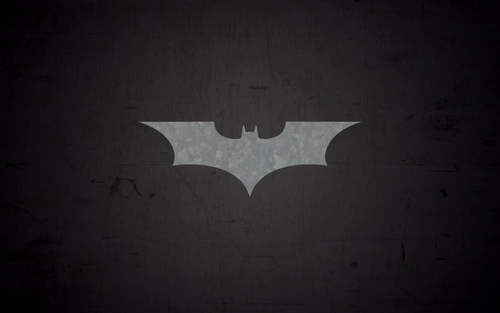
Now, time to mess with some layer modes. For the first galvanized metal texture layer I used Color Dodge with 40% fill, then I duplicated this layer and changed the layer mode to Overlay and left the fill opacity intact.
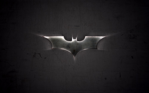
Not really noticeable, hey? Anyway, to finish off I added one more texture on top, with a large rusty bit at the top:
For this layer I used Linear Burn and 27% fill (please remember, all the textures used in this tutorial can be downloaded from CG Textures).
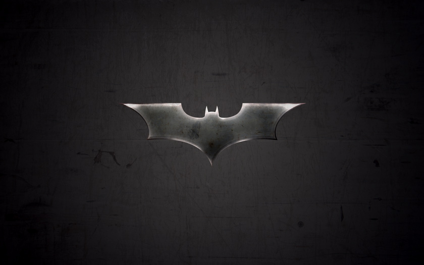
(click for larger version)
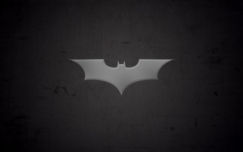
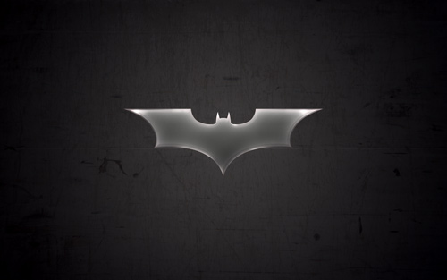
6. Finshing Effects for Bat Logo
OK, to finish off with the bat logo I think we should add a shadow and also one of those cool light rays in the background. For the shadow, simply apply an Outer Glow layer style to the main layer.
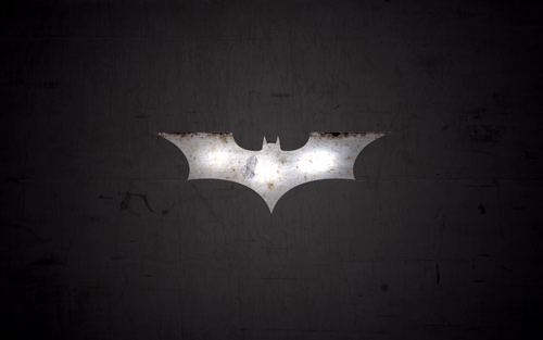
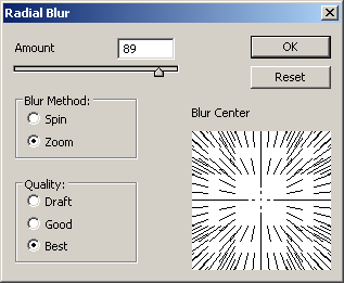
For the ‘cool light ray’ effect I was talking about, get one of your original bat logo layers (with one solid color) and apply Filter > Blur > Radial Blur with similar settings to these:
Now we have a cool blur like this:
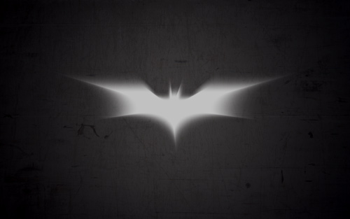
I think a good idea for a better effect would be to make the shape slightly bigger before apply radial blur, so it stands out on the sides a little bit more. Anyway, after you’re done with the radial blur, change the layer mode to Color Dodge and lower the fill if you think it necessary.
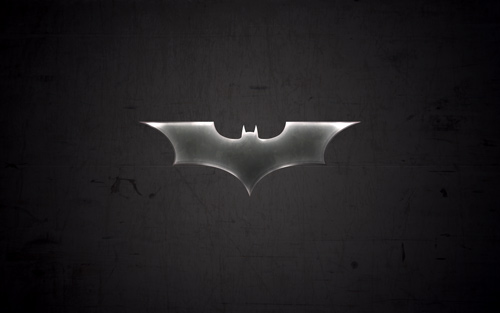
So, as you can see, on the left we have the final bat logo on top of the light ray in the background, and on the right is the final light ray with the layer mode changed.
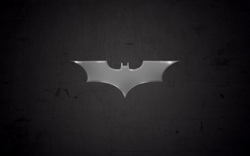
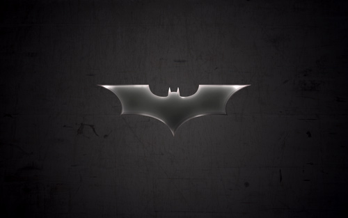
Further Effects
As I write this I continue getting ideas to improve on the final product, but I can’t list them all! You should keep adding your own stuff to the outcome though, as you’ll always come across a better effect.
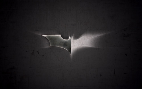
One idea is to create another light ray effect and place it on top of all the other layers, use a layer mode such as Overlay and erase away some of the inner area.
(additional light ray effect on the right, as explained above)
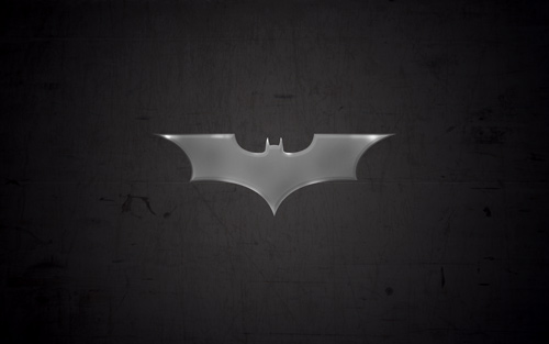
7. Additional Textures
If you want a much darker outcome, you should continue adding textures on top of the whole document (not just the shape or the background, but the whole thing) and continue playing with layer modes, fills, layer masks, etc.
Don’t forget the ole trusty but crusty brushes either!
(more textures, more adjustment layers, etc.)
Subscribe?
Don’t forget to subscribe to PhotoshopStar so you don’t miss any updates!