In this simple ‘n’ easy tutorial I’m going to be teaching you how to create an effect similar to the one shown below, a glossy kind of ‘dollar sign logo’, great for Webmasters, right? 😉

(please note: You can click on any of the images in this tutorial to see the larger images)
1. Document
Firstly, of course, you’ll want to create a new document in Photsohop – for this tutorial I’m using a 400 x 400 pixel document with a Resolution/DPI of 300. Now, design a nice basic background for your canvas – I simple used a radial gradient of #049de2 to #005d92. I came up with this:

To finish off the background you might want to add in a nice highlight effect to the background, you can achieve this effect by firstly making a path using the Pen Tool, afterwards you want to turn the path into a selection (right-click the path, then go to make selection) after making your curvy selection, fill it with some white brushing or a white gradient. You can make your white brushing blend in with the background by changing the Layer Mode to Overlay or Soft Light.

2. Create Text
Alright, time to write out the text ($). Start by getting out the Horizontal Type Tool (press T on the keyboard) then write out your text. I used a nice green for my text, #7cd120.

For my text I used the font Helvetica Neue, and a font size of 50 pt, but you can feel free to use any font and any font size, it doesn’t really matter – take note that a good alternative to Helvetica is Arial.
Time to add some nice effects. Start by right-clicking your text layer in the layer’s palette, then go into the Blending Options, use the following:
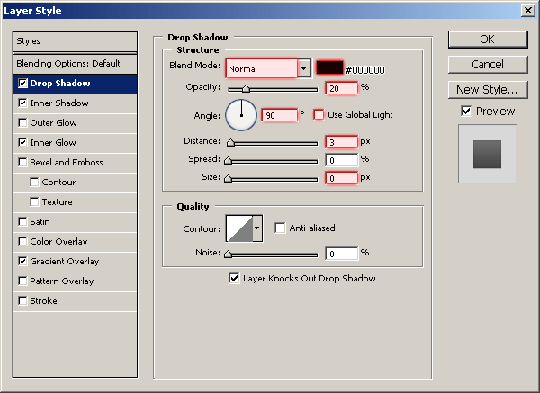
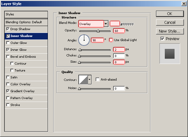
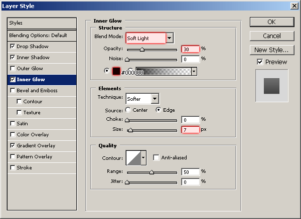
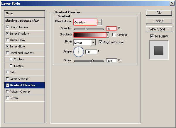
And now your text should look something like this:

Looks pretty nice so far, don’t yoy think?
3. Adding further Effect
Next thing to do is add a few nice details to the text.Start by making a new layer, then select the text by holding ctrl and left-clicking the thumbnail in the layer’s palette.

Next, in your Photoshop menus, go to Select > Modify > Contract, and use a radius of about 2-4 pixels, not very important here.

So, be sure you’re on a new layer then fill your selection with white (#ffffff). With your selection still active, move it up about 2 pixels and press delete.

In the above image I have also moved the layer up 2 pixels after deleting the larger portion. To make this layer blend a little better, lower the opacity to about 40-60% and change the layer mode to either Overlay or Soft Light, your choice!

4. Finishing Off
To finish this off, you might want to make a smaller version of the dollar sign logo and move it over to the right a little beside the original. You can do this either by duplicating your original text layer and making it smaller, or you can duplicate both of your layers, merge them together then resize it.
This is what I ended up with anyway:

I’ve also made my result image into a neat little MSN display picture, which I occassionally use 😉

Feel free to use the display picture if you want to! Well, this tutorial is over. Thanks very much for reading, and I hope you enjoyed.