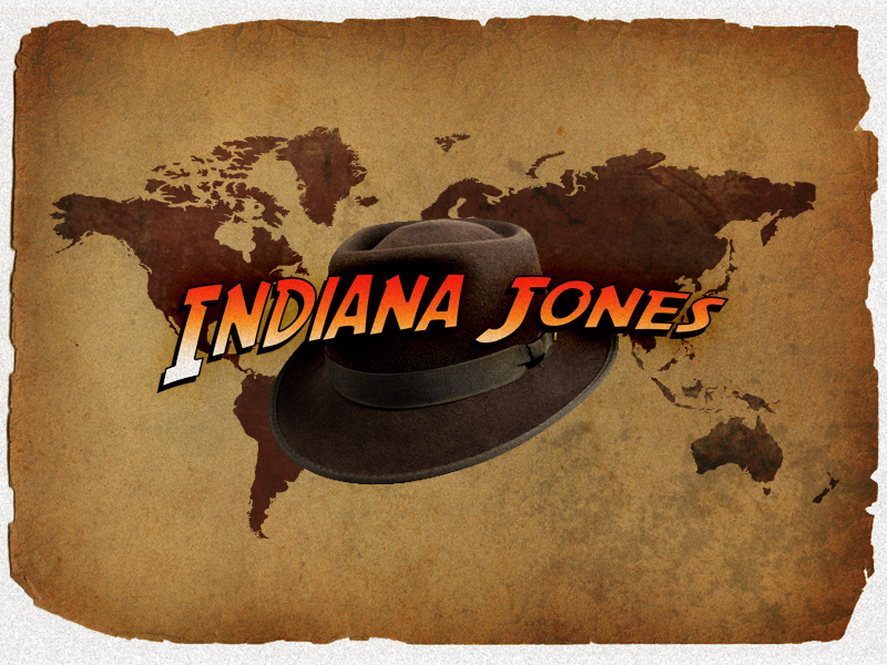
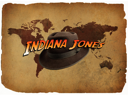
I thought we would celebrate the upcoming release of Indiana Jones IV, the Kingdom of the Crystal Skull by learning how to remake the awesome Indiana Jones text! So, I’m going to attempt to remake the text effect used in the posters and promotional images 😛
Please note that attempt is emphasized above! This is as close as I could get it, I hope it’s good enough!
1. Document Creation
We need to start by creating a new document. For the document that we’ll be making our text in we should use a relatively large document size, I used 1600 x 1200 pixels, with the default resolution. I used this size so I can resize it smaller later on when I copy it over to another document.
2. Text & Font
Go to Google and search for the Indiana Jones font (SF Fedora), you should be able to find it as the top result. Otherwise, you can just download it from either of these direct links: 2.
After you’ve downloaded the font, (extract it) then copy it to the windows/fonts directory, or wherever your operating system stores the fonts!
Back to your Photoshop document. Select the Horizontal Type Tool and write your text on the canvas, using a large enough font size to take up most of the width of the document, I used a font size of 190 pt. To get a result as similar as possible to the original text, you should capitalize the first letters of each of your words, so they stand out from the rest.

Now we’ve got the text using the right font, we need to distort it a little bit so it looks more like the original, near the top of Photoshop (next to the font settings, etc.) you’ll see an icon that has a T and a curved path underneath it, it’s the Warped Text Icon. Click it and mess around with the settings until you get a distorted text that looks right!

There should be all the settings you need in the above image, if not, you can download the complete PSD(s) at the end of the tutorial. Lastly, to finish off the text shape, I rotated it slightly to the left (hold ctrl and press t to go into transform mode). Onto the styling part of our text.
3. Style your Text
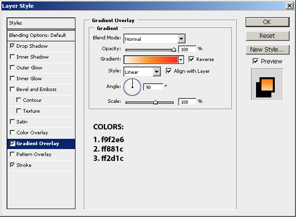
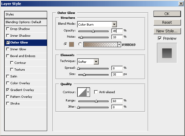
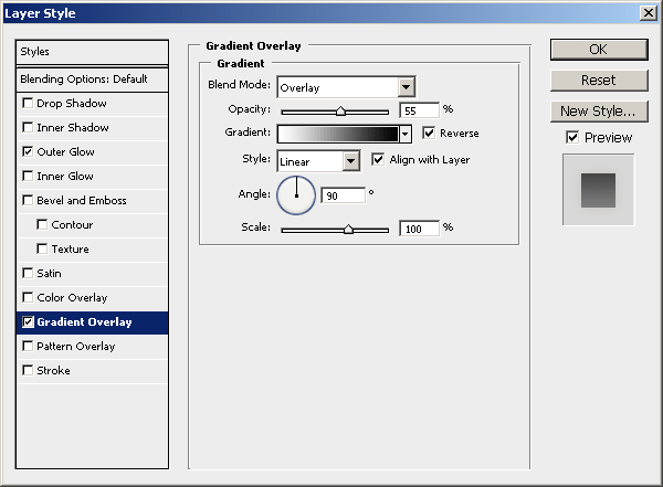
I think it’s time to add some life to our text. Start by right-clicking the text layer and going into the Blending Options, then click and apply the following layer styles/settings:
You will definitely need to mess around with the layer style settings above if you’re using different font sizes and all, so feel free to do that if it looks a little off.
After applying these layer styles my text looks like this:

I think we’re pretty much done for the text now, now we just need to make a nice background for the text to go on! If you want to learn how to make a cool paper background like the one shown in the result image at the top of the page, follow the next steps.
4. Background Creation
Now we’re going to make a really nice background for the text to go on. Create a new document in Photoshop, this time something like half the size of what you used before (800 x 600 px).
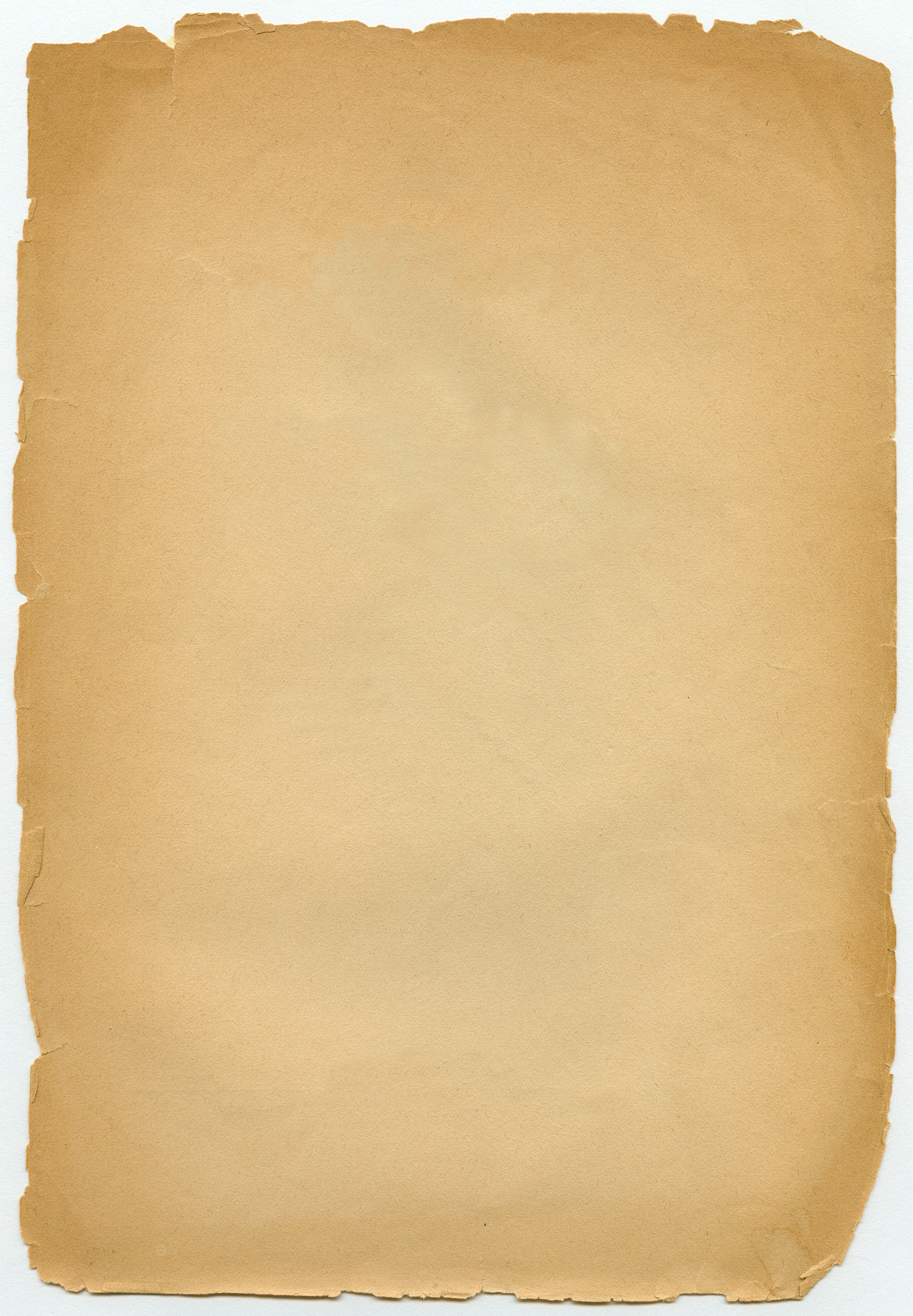
Now you’ll want to find a nice paper texture or something, there’s some pretty good stuff over at BittBox, I’m not sure if it’s completely suitable though. The base paper texture that I ended up using was one I think I downloaded from sxc.hu (stock.xchng) a long time ago, you can download it from here.
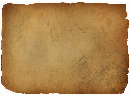
Copy your paper texture into your new document and get to work doing with it what you want, I just resized it down so it fits completely inside of the document. Next, you might want to add a little more interest/detail by adding a little bit of grunge brushing on some new layers, messing with the layer modes and opacities, etc.
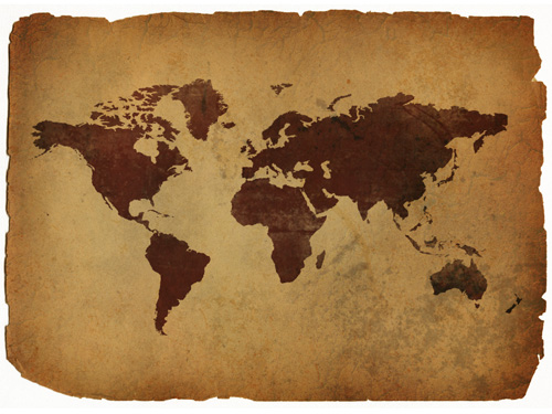
This is what I’ve got after a bit of brushing:
If you want to see everything I did to the background you should download the PSD file at the end of this tutorial. The last thing I did for the background was add in a cool world map shape and blended it in a little bit. You can download the world shape files that I used from lukeroberts on deviantART.
After you’ve installed the shapes in Photoshop, drag the world one onto the canvas in a new layer, using a darkish-red color (#622d23).
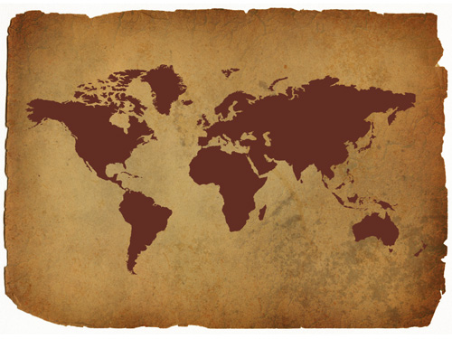
To this shape layer I then changed the layer mode to Linear Burn, lowered the opacity to around 80%, and also lowered the fill to around 90%. After this, you may want to take a grunge eraser to the shape image, or more efficiently take a grunge brush to a layer mask added to the shape layer!
Now… maybe we could add in a few more details before we copy over the text. How about Indy’s hat? Go to Google Images and see if you can find a good photo of his hat, copy it to Photoshop and cut it out as best you can.
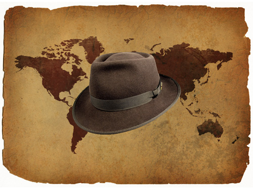
Now, darken Indy’s hat a little bit if you think it’s necessary (ctrl+l), then size it down a smidge (ctrl+t).
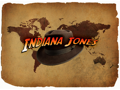
Looking good. Now we can copy our text onto the canvas. Open up your other document, merge the text layer(s) togethe rif necessary then copy and paste it to your background document.
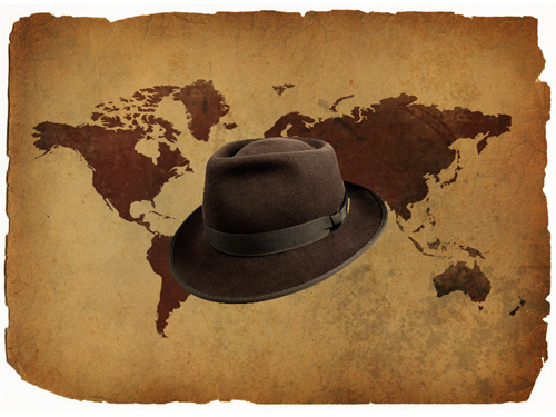
In the above image my text was resized to 40%, resize your text to whatever is suitable.
Assuming you merged your text layer with another layer to ‘apply’ the layer styles to the pixels, apply the following layer styles to your finished text layer, to give it a more polished finish:
The outer glow brought out the bright orange a little more, I quite like it:
 Well, we’re pretty much finished for this now, but I went on to add a little bit more texture and interesting…ness! 🙂
5. Polish / Finish
To finish off, let’s make the whole image look a little bit more interesting. Create a new layer, fill the layer with white (#ffffff) then apply Filter > Noise > Add Noise with an amount that will show up on the white background.
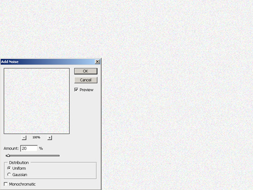
For the Noise settings you can use either Monochromatic, or not. After you’ve done all this, hit ctrl+t and size it up a little bit, so to enlarge the noise pixels. Change the layer mode to Multiply and lower the opacity if you see it necessary, this effect isn’t really too noticeable, it’s just a nice effect. If you were hide and unhide the layer you’ll be able to see a bit of difference.
To finish off…
First, create a new layer, press ctrl+shift+c and then ctrl+v. This copies everything visible in your document to a new layer. After this, apply a filter that you like. I used Filter > Artistic > Film Grain.
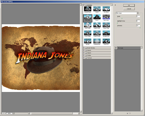
- Grain: 4
- Highlight Area: 0
- Intensity: 10
This is a really cool effect, but maybe a little too intense. Lower the opacity for this layer to something around 30-50%.
Feel free to try some other filters and layer modes, etc.
Complete
Looks like we’re done! I hope you enjoyed this Photoshop tutorial, everyone.
Remember to always get creative and add your extra bits to the graphic (whilst following the tutorial!)