In this little Photoshop tutorial we’ll be designing a quick art piece, then we’ll be adding some texture to it, this is to demonstrate the use of texture in artwork, as you may be able to see in works from people such as GoMedia. Obviously this method will work better with some things and not so well with others, so please try to use it in moderation, if you will.
Yes, my opinion may be a little bit biased in the above image, but you know, you get the point 🙂
1. Background Creation
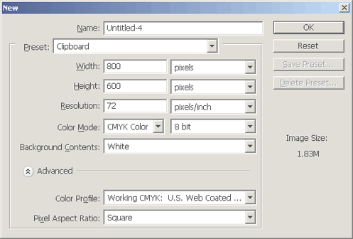
Let’s start with a new document. For this Photoshop tutorial I’m using a rather puny size of 800 x 600 pixels, feel free to use a larger size though. I left the Resolution at it’s default as well, 72. I did however use CMYK color (default is RGB) for this tutorial, not sure why, but if you want the same result as mine you’ll want to change this setting.
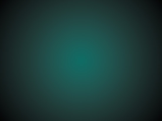
After we’ve created our document, we want to make a nice basic background. Start by getting out the Gradient Tool, and setting up your settings similar to mine:
![]()
The colors I’ve got set for my gradient in the above image are #010001 and #0d6c65. To make things easier now, you might want to set up some rulers in the center of your document. Press ctrl+r to enable rulers, then drag some onto your canvas, like so:

Now drag your radial gradient into the middle of the canvas, obviously having the lighter color in the middle.
Want to add anything more to the background? Then continue on, at your own risk … or you can skip to the next step 🙂
Next we’ll add a cool starburst effect to the background. Get out the Custom Shape Tool from the Photoshop tools and find the starburst shape, drag it onto your canvas like I’ve done in the below screenshot:
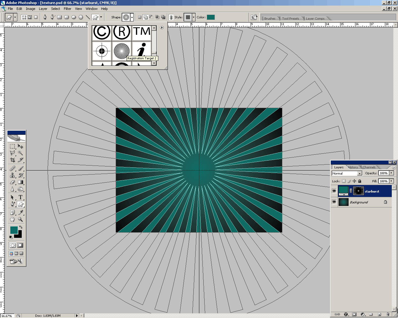
Note that the color I’m using for my starburst shape is the same as the green that I used for my background. After you’ve done all this, mess around with the layer mode and opacity for your starburst layer. I used the layer mode Color Burn and lowered the opacity to 20-30%.
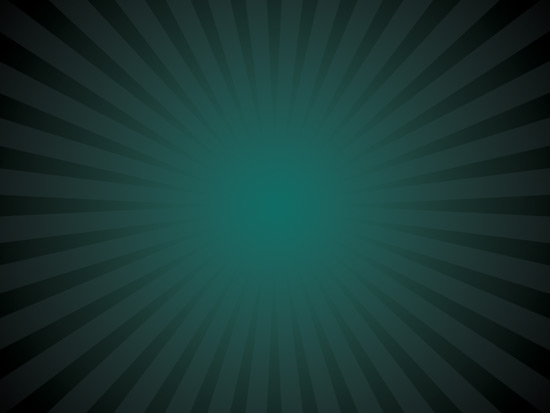
I’m pretty sure we’re finished for the background now, let’s move onto the next step.
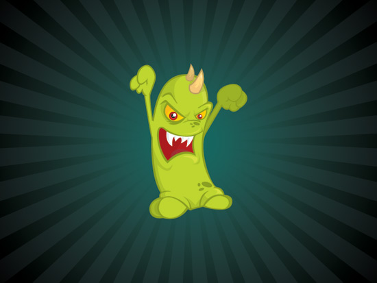
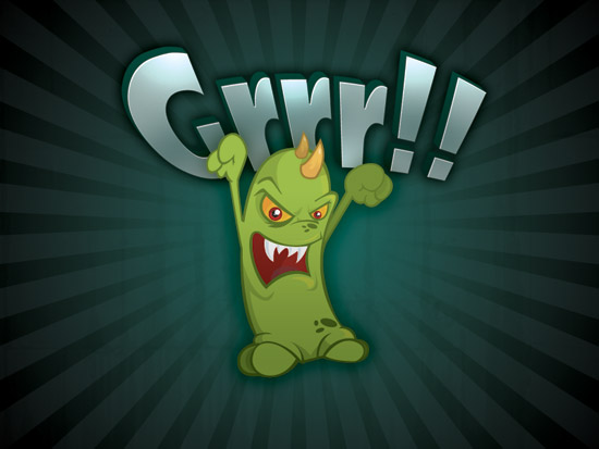
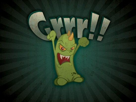
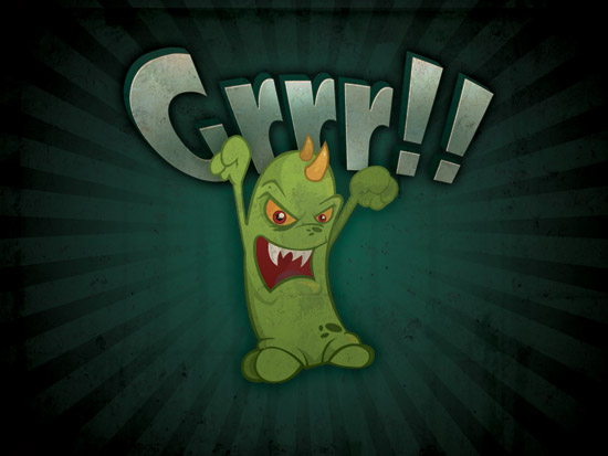
2. Add your Mascot
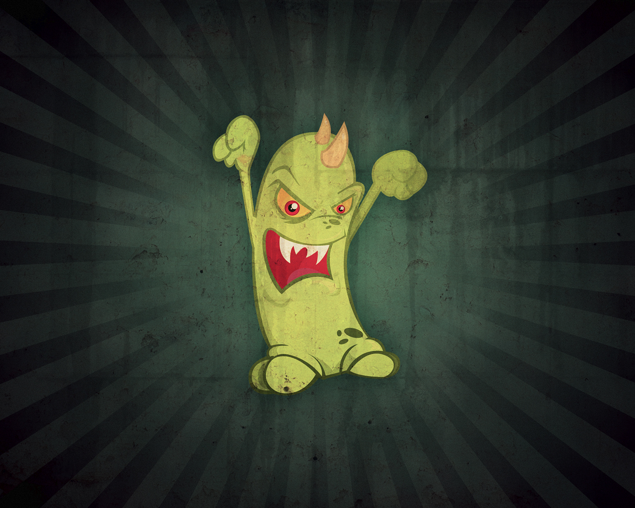
I’m not sure if you could call it a mascot, but here I’m adding in a cool monster vector that I bought a little while ago from iStockPhoto. Since you’re meant to buy these from iStockPhoto, I can’t really give you the vector.
(Note: If you want to make a graphic like the one shown above using Illustrator, you can check out a few good tutorials on the subject at SpoonGraphics: 1 2 3 4)
If your mascot/whatever is as bright as mine you’ll definitely want to darken it up a little bit by using Levels (ctrl+l) and maybe even Hue/Saturation (ctrl+u).
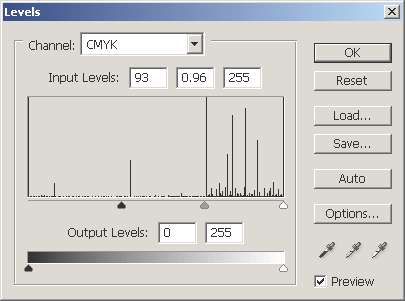
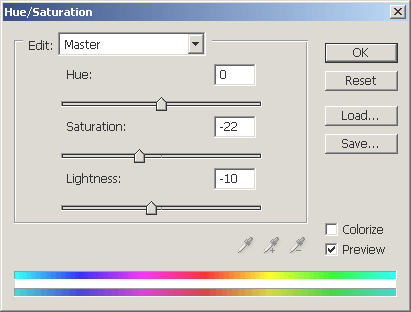
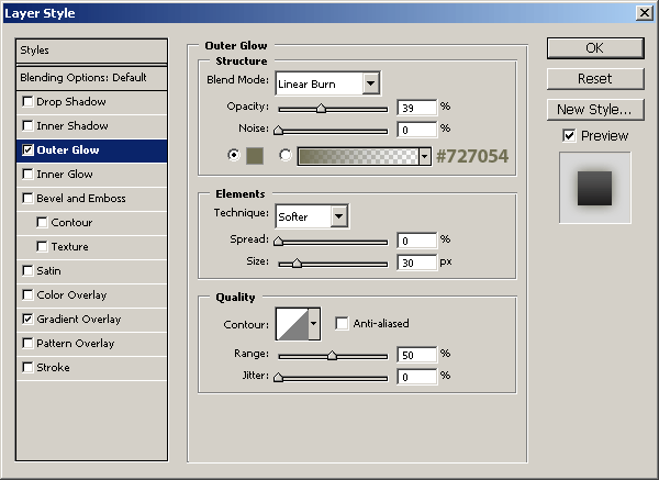
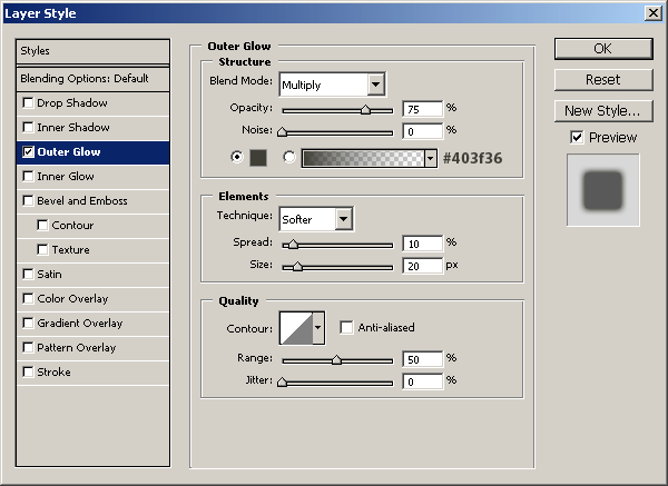
Be sure to mess around with different settings until you get a nice effect. After you’re happy with the color adjustments, apply an Outer Glow and Gradient Overlay layer style with the settings shown below.
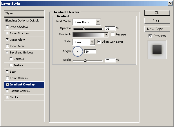
Now you should have something like this (left side, obviously):
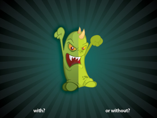
With or without the adjustments and layer styles? I think I’ll go with the first option. Well, I think we’re done for this part. Let’s add a few more interesting bits, then get on with the texturing.
3. Add Text
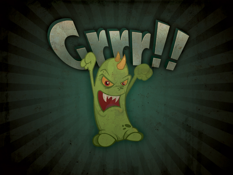
How about we add some wicked, cartoon-style text to the background of our image? Yes, no, maybe?
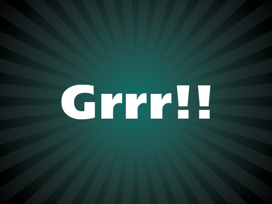
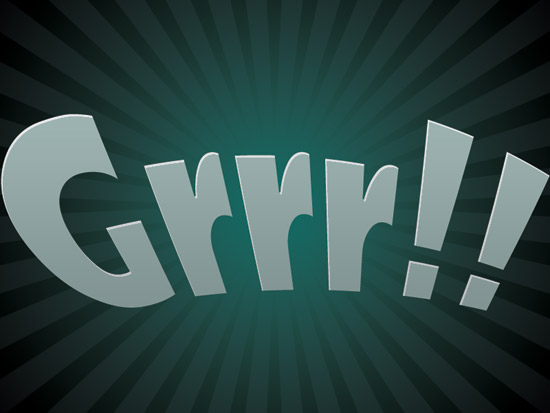
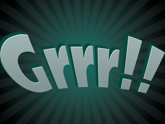
Start by getting out the Horizontal Type Tool and writing out some text, for this example I used the text ‘Grrr!!’ 😉 I find that it’s best if you use a very fat fat, sans-serif font. Arial Black might be a good option.
It might be easiest if you hide the layer you were previously working with, so we can concentrate on the text easier.
After you’ve written out your text onto the canvas, and you’re happy with it, distort it by clicking the little icon near the top settings, it’s called ‘create warped text’.
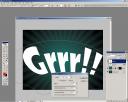
By clicking on the above image you’ll be taken to a screenshot of my Photoshop work place, you’ll be able to see the settings I used and what icon you’re meant to be clicking on. We want to make an interesting, somewhat 3D-style text effect here.
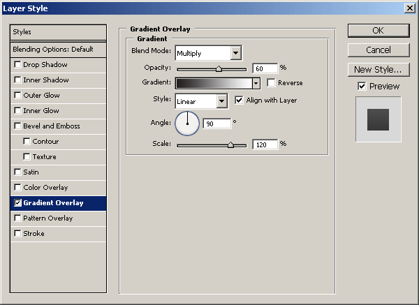
After you’re all done with this, change the text’s color to a green color, similar or the same as what you used in the original background gradient. After this, I finished off by applying three layer styles:
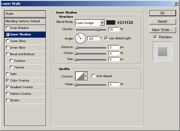
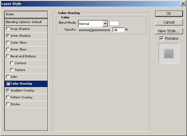
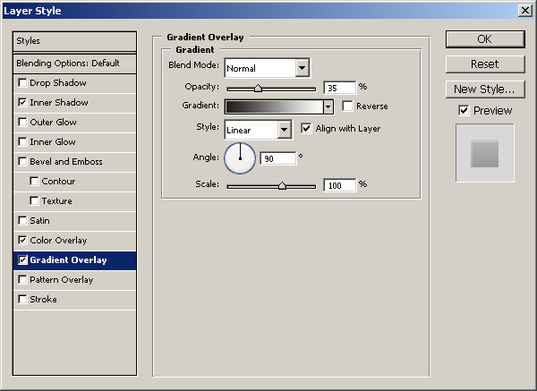
Now we’ve got this:
You could finish here, or we could continue a little further and add a kind of 3D effect to the text by adding a solid drop shadow. Do this by holding your alt key down on your keyboard, then using the arrow keys to move and duplicate your text layer.
Do this as many times as it takes, then merge all of the text layers together. After merging all of your text layer duplicates together, move them underneath the original text layer. Now fill the solid drop shadow layer with a dark color of your choice (here’s to hoping I just made sense).
Finish this off by applying a Gradient Overlay layer style to your drop shadow layer. Lastly, unhide your mascot layer and position it down a little bit from the center, merge your text layers together and transform it into a suitable position.
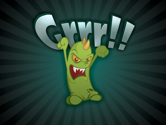
As you can see, my text in the above image looks a little different, after I merged all of my text layers together I used the Dodge Tool to add a few slight highlights to the text, then I resized the text down a bit and moved it into place.
You may also want to apply an Outer Glow shadow to the text layer. We’re pretty much done for the text now, sorry if I wasn’t able to completely explain the process.
Remember, at the end of the tutorial you can feel free to download the PSD file, which includes the original text layers as well.
4. Add Textures & Adjustments
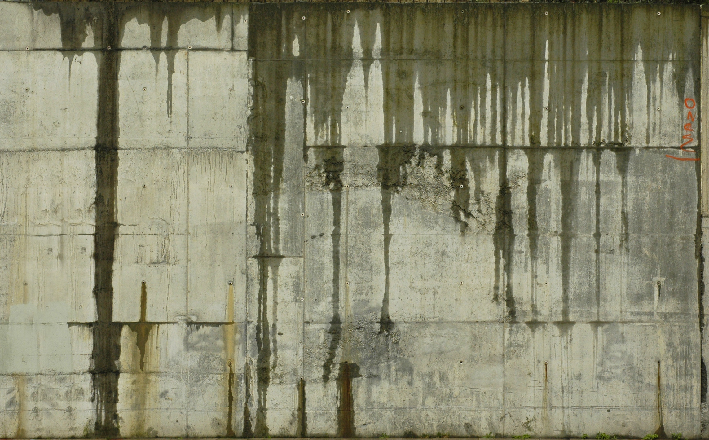
Pick out a few nice, different textures then open them in Photoshop. After you’ve got them open, copy them one by one and paste them to your other document. Now you can resize them down to a reasonable size. For most of them I just resized them down to the document size.
Here you can download the two exact textures that I used:
Download the two I used if you like and copy them onto your document. Start with the dirty/slimy concrete texture, put it just above your starburst layer and start messing with the layer modes and opacity. I ended up using the layer mode Multiply, with a very low opacity (10-15%).
It’s not too noticeable, but it’s important nevertheless. Next, get the other rockier texture and put it on top of all of your layers. Mess around with the colors of the texture, the layer modes, and the opacity/fill as well.
I find that (in the above image for example), Multiply as the layer mode works very well, and an opacity of around 70%. Also try: Linear Burn with an opacity of around 50%. Keep messing around with the colors, adjustment layers (if you like) and even duplicate the texture layers and try more things.
To finish off I added in the slimy concrete texture again and used the layer mode Multiply, with a fairly low opacity (50%). Now, this may look too intense now, just add some layer masks to the appropriate texture layers and brush away with a soft grunge brush.
How’s yours looking so far?
You can finish off by adding a few layers with solid colors in them, then mess with the layer modes and opacities. I did just one, I made the new layer, filled it with #4c2124 then changed the layer mode to Pin Light and lowered the opacity to 9%. Just for small details really.
Finito
Well, I think I’ve pretty much explained all I can for this tutorial.
Thanks for reading this tutorial everyone, I hope you enjoyed it! If you enjoyed the tutorial, why not subscribe to the RSS feed for updates? Cheers!
Additional Wallpapers
Since I wrote this tutorial I’ve used the method a few times when making wallpapers, please feel free to download these and use them. My apologies, but all of the wallpapers below are 1280 x 1024 in resolution, I hope this is alright!