Before you can properly use Photoshop you have to understand digital color and how Photoshop deals with it.
View Other Articles in This Series
- How to set up Photoshop
- Photoshop Interface Explained (Part 1)
- Photoshop Interface Explained (Part 2)
- Introduction to the Photoshop Toolbar (Part 1)
- Introduction to the Photoshop Toolbar (Part 2)
- Introduction to the Photoshop Toolbar (Part 3)
- Photoshop Channels and Color
- Photoshop Selections (Part 1)
- Photoshop Selections (Part 2)
- Photoshop Layers
Resources
Modern display devices (LCD, CRT) use the RGB color model. This is an additive color model which means that in order to create a certain color, light has to be added.
How digital color works
Let me explain to you how digital color works. As you know, monitor displays are made up of pixels which are little squares that emit light. Each pixel can emit red, green and blue light in various amounts. These amounts are measured from 0 for no light to 255 for maximum light.
So in order for the blue color to be displayed the pixel will emit 255 amount of blue light and so on for red and green. But what if we want some other color, like yellow? Well, like I told you before, RGB is an additive color model which means that color is created by combining different lights. So for yellow the pixels will emit 255 amount red light and 255 amount green light for a pure yellow color. For a magenta color then the pixels will emit 255 red light and 255 blue light. Of course it is not necessary to have exactly 255 of each light in order to create color.
We could have a reddish yellow by using 200 red and 100 green light. But what happens if we add some blue light to our yellow color recipe? Will the color became bluer? Not exactly, because we are dealing with light if we add a little blue then the color will became brighter. As you can see figuring out how color works from the numbers it is difficult so that’s why the HSB color model exists. Think of it as a chart, a reference which will help you understand digital color better.
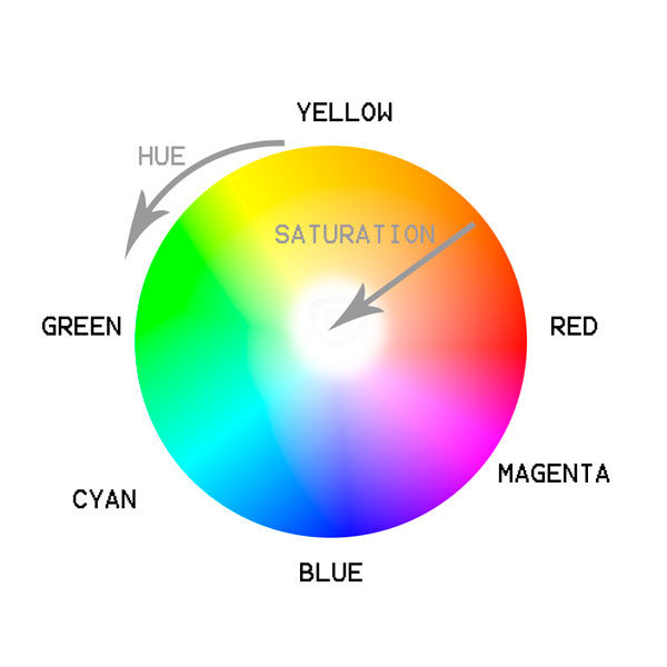
You can see from the chart that hue is the actual color while saturation is the intensity of that color. Brightness is the lightness of that color. Let me explain to you how I see the chart. Think of color as recipes and lights as ingredients. Each recipe has to have at least 1 ingredient (1 light) in order to work except for black which is the absence of light. So in order to get yellow I will have to add to my recipe red and green and I will have a fully saturated yellow. If I add blue to the recipe then the color migrates towards the center of the color wheel making my yellow less saturated.
Let’s do an exercise. Let’s suppose that I have 50 red, 100 blue and 10 green. Can you guess which color will be displayed? It will be a bluish magenta, not fully saturated. That’s because its 2 main ingredients are red and blue which results in a magenta color while the third ingredient, in our case the green color determines the saturation. The less of the third ingredient the more saturated the color will be. The complete lack of the third ingredient will result in a fully saturated color.
Let’s take another example. Let’s say I have 150 green, 100 red and 80 blue. What color it will be? The 2 main ingredients (or the first 2 largest numbers) are 150 green and 100 red. The secondary ingredient is blue (the smallest number of the three). So we will have a greenish yellow very desaturated because the blue is pulling the saturation towards the center of the wheel. You get it? To resume let’s say that the main ingredients determine the hue (red + green = yellow, red + blue = magenta, blue + green = cyan), the secondary ingredient determines the saturation (more of the secondary ingredient means less saturated colors) and the sum of all numbers is the brightness.
This discussion brings us to channels. Think of channels as black and white representations of an image. For example the red channel of a picture is the black and white version of an image. If this black and white image is bright then we have a lot of red light in our image and if it is dark then we have a little red light. If there is 255 red light then we will have a white image and if there is 0 red light then we will have a black image. Think of channels as visual representations for each main color (red, green, blue). If the green channel is light then we know that we have a lot of greens. If the green channel is dark then we know that we have little green light in our image.
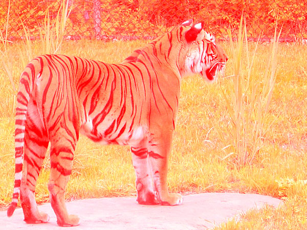
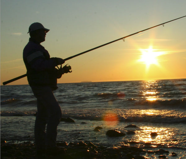
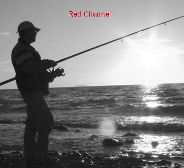
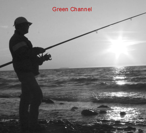
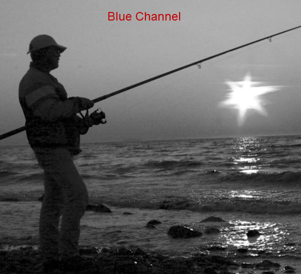
Observe the reddish image above. Can you guess which color channel will be predominant? If not, look at the channels of this image below:
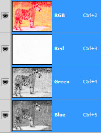
As you can see the Green and Blue channels are fairly dark but the Red channel is so white it is almost translucent. This means that we have a lot of red color in our image. You may wonder how this will help you with your own images. Well, I do a lot of photo retouching and when I first open an image, before doing any adjustments whatsoever I do the “Channel Walk”. No, it’s not the “Moon Walk”, it’s the “Channel Walk”. If you are imagining some kind of strange dance movement you’re wrong! The “Channel Walk” is the process of quickly viewing each Channel in part and analyzing the information I get from there. You may think that there’s not so much information in a black and white version of the image but you’re wrong.
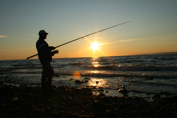
Let me give you a practical example. Take a look at the image below. Can you tell what adjustments need to be made? If you are thinking that this image is noisy and needs color correction then you are right. But how should I color correct it? One could simply add a Curves Adjustment Layer and play with the curves until some (apparently) good looking results start emerging. Then a Filter > Noise > Reduce Noise would be the next logical step. But this is not the approach a Photoshop professional like yourself should take. Let me show the professional, right way to use your newly acquired knowledge about channels to tackle this problem.
Open photo. First, do the “Channel Walk”. This means to press Ctrl + 3 (Red Channel), Ctrl + 4 (Green Channel), Ctrl + 5 (Blue Channel) and use the information for further adjustments.
The Red Channel seems ok, except for the little black patches. Those little patches of dark are nothing else but noise. Hmm, I think to myself, I have a little noise in the red channel. Let’s move on.
The Green channel looks alright, and is less noisy than the Red Channel. Let’s move on.
Oh my. What an ugly thing to see. The Blue Channel is noisy as hell (this is common in digital imagery, the Blue Channel is usually the noisiest channel of all) and has some big, and I mean big areas of total darkness. This is not ok. How can I interpret this information? Because I (we) know that the darker the channel the less specific light it will produce, this means that where the image is dark in the blue channel there will be no blue color whatsoever. This means that in those areas the Red and Green channels will be the main suppliers of the color information. We know that Green and Red colors are the recipe for fully saturated Yellow so the conclusion we draw is that we have a yellow color cast.
If you don’t get this the first time know you’re not alone. Channels and colors are a hard nut to crack at first, but once you experiment on you own a little bit this will be a walk in the park.
Let me quickly recap. The red channel is a bit noisy but ok. The green channel is less noisy, that’s good. The blue channel is very noisy and it has big black areas. Lack of color from the Blue channel means that that the color will be formed from the Green and Red channels and because Red + Green = Yellow we conclude that we have a yellow color cast.
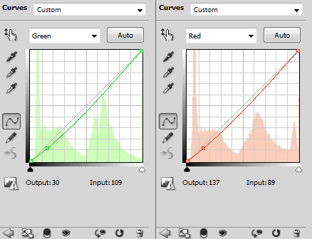
In order to color correct this image we add a Curves Adjustment layer (Layer > New Adjustment Layer > Curves) and slightly drag both the Red and Green curves downwards to lower the amount of light these channels contribute to the overall image.
So this is the image before adjustments. Now you can see that it has a pronounced yellow color cast.
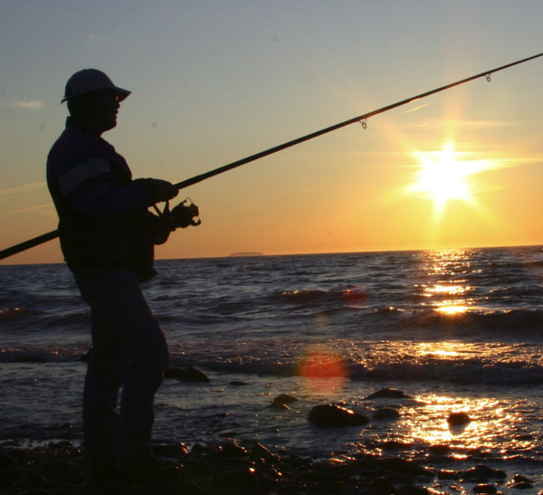
And this is the image after the adjustment. The difference is subtle but noticeable.
In the next steps we could maybe use the Reduce Noise filter on the blue channel alone or we could make a new layer from all visible layers (Ctrl + Shift + Alt + E) and then apply Reduce Noise filter to this layer alone and change the blend mode to Color so only the Color noise would be affected. However, noise reducing is a different topic so I won’t be covering it here (I am a fan of Lab color mode and this allows for some amazing manipulations of color and noise removal without affecting the luminance integrity of the image. But I digress.)
In the example above you saw a little practical example of how to use Channels to help color correct the image. Note that this barely scratched the surface of the usefulness of Channels, so don’t limit yourself to this, and learn as much as you can about them if you want to be a Photoshop Pro.